
Blog
Built Your Own Squarespace Site? It Might Be Time for a Tune Up
Squarespace site not pulling its weight? A Tune Up can sharpen copy, layout, SEO and enquiry paths without starting again.
TL;DR:
- Conversion optimization boosts small business revenue by focusing on clear messaging, compelling copy, and reducing friction. Prioritizing headline and call-to-action improvements yields the highest conversion lifts before making design or technical changes. Continuous, data-driven testing and iterative adjustments ensure sustainable growth over time.
Website conversion optimisation (CRO) is the process of turning more of your existing visitors into enquiries, bookings, or sales by improving your messaging, user experience, and site performance. The average cross-industry conversion rate sits at 3.3%, while top-performing sites regularly exceed 10%. That gap represents real revenue. For a small business, moving from a 2% to a 3% conversion rate delivers 50% more revenue without spending an extra dollar on traffic. This guide walks you through the priority hierarchy, practical tactics, and a repeatable testing process to make that shift happen.
Not all conversion improvements are equal. Copy-driven changes to headlines, calls to action, and proof elements deliver 50 to 200% conversion lifts. UX and design improvements typically yield 10 to 50%. Technical fixes like page speed and broken links contribute 2 to 10%. Copy changes outperform design changes by five to ten times. That means most small businesses are leaving significant gains on the table by focusing on visual redesigns before they have confirmed their messaging is clear.
The practical implication is this: before you invest in a new layout or a faster server, confirm that your headline communicates a specific benefit, your call to action tells visitors exactly what happens next, and your page answers the questions a cautious buyer would ask. These are Tier 1 priorities.
| Priority tier | Element type | Typical conversion lift |
|---|---|---|
| Tier 1 | Headlines, CTAs, value propositions, social proof | 50 to 200% |
| Tier 2 | Navigation, mobile UX, form design | 10 to 50% |
| Tier 3 | Page speed, broken links, technical fixes | 2 to 10% |
Tools like Google Analytics, Hotjar, and Microsoft Clarity help you identify where visitors drop off before you commit to any changes. Use them to confirm which tier is causing the most friction on your specific site, then work top to bottom.
Pro Tip: Start your CRO audit on the page that already receives the most traffic. Improvements there compound faster than on pages with low visitor numbers.
The most common reason a small business website fails to convert is not poor design. It is unclear messaging. Visitors arrive with a specific problem and scan for evidence that you solve it. If your headline describes your business rather than the visitor’s outcome, most people leave within seconds.
Effective headlines follow a simple rule: state who you help and what changes for them. “Fixed-price WordPress websites for Canberra small businesses” outperforms “Welcome to our website” because it answers the visitor’s first question immediately. Voice-of-customer language, drawn from real reviews, enquiry emails, or sales conversations, is the most reliable source of headline copy because it uses the exact words your buyers already think in.
Calls to action deserve the same precision. A single, outcome-focused CTA such as “Book a 30-minute strategy call” increases conversions by up to 371% compared to pages with multiple competing options. The mechanism is straightforward: fewer choices reduce decision fatigue. Every additional CTA you add splits attention and reduces the probability of any one action being taken.
Trust signals matter most at the moment a visitor is deciding whether to act. Testimonials, case studies, recognisable client logos, and specific results all reduce the perceived risk of taking the next step. A local business case study showing a concrete outcome is more persuasive than a generic five-star rating because it is specific and believable.
Pro Tip: Pull three to five phrases directly from your best client reviews and test them as headline variants. Buyers trust language that sounds like them, not like a marketing department.
Friction is the biggest conversion killer on most small business websites. Every extra step, confusing label, or slow-loading page increases the effort required to convert, and reducing that effort directly increases the likelihood a visitor follows through. The good news is that friction reduction often requires no design work at all.

Forms are the most common friction point. Reducing form fields from 11 to 4 increases sign-ups by 120%. Cutting a checkout form from 6 fields to 3 boosts ecommerce conversions by 50%. The principle is to ask only for what you genuinely need at that stage. Progressive profiling, where you collect additional information across multiple interactions rather than all at once, keeps the initial barrier low without sacrificing data quality over time.
Mobile experience deserves specific attention. Mobile conversion rates are 50 to 60% of desktop rates, largely because of slow load times and poor UX on smaller screens. That is a significant revenue gap for any business whose visitors arrive primarily on phones. The fixes are practical and worth prioritising.
“Speed is not a technical nicety. On mobile, a 0.1-second improvement in load time boosts retail conversions by 8.4%. Every second of delay costs you real enquiries.”
Navigation friction is subtler but equally damaging. Menus with too many options force visitors to make decisions before they understand your offer. A focused navigation with three to five items, each pointing to a clear destination, keeps visitors moving toward conversion rather than wandering. Removing exit points from high-intent pages, such as your contact or booking page, is one of the fastest ways to lift completion rates. You can read more about structuring this in the Asporeadigital guide on designing a clear path to purchase.
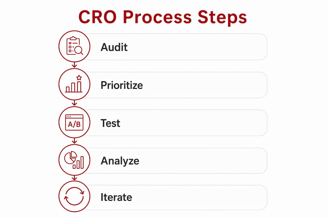
A structured process separates businesses that see consistent conversion growth from those that make random changes and wonder why nothing sticks. CRO is an ongoing iterative cycle that replaces guesswork with data-driven decisions. The process below is repeatable and scales to any budget.
| Common mistake | Why it hurts | Better approach |
|---|---|---|
| Testing too many elements at once | You cannot identify which change caused the result | Test one element per experiment |
| Ending tests too early | Results lack statistical confidence and mislead decisions | Run for at least two weeks with sufficient traffic |
| Skipping the audit phase | Changes are based on assumptions, not evidence | Always review analytics and recordings first |
| Chasing Tier 3 fixes first | Minimal conversion impact for significant effort | Start with copy and messaging changes |
Pro Tip: If your site does not yet receive enough traffic for statistically valid A/B tests, focus on qualitative methods first. Five user interviews or ten session recordings will reveal more about conversion barriers than a test with insufficient data.
Conversion rate optimisation works best when you prioritise copy and messaging first, reduce friction in forms and mobile experience second, and apply technical fixes third.
| Point | Details |
|---|---|
| Start with copy, not design | Headlines, CTAs, and proof elements deliver the largest conversion lifts before any redesign. |
| Reduce form fields | Cutting fields from 11 to 4 increases sign-ups by 120%; ask only for what you need upfront. |
| Fix mobile UX deliberately | Mobile conversions are 50 to 60% of desktop; large tap targets and fast load times close the gap. |
| Test one change at a time | Only 1 in 8 A/B tests yield significant results; rigour and patience outperform volume. |
| CRO is a continuous process | Treat each test result as data for the next hypothesis, not a one-off project. |
I have reviewed a lot of small business websites over the years, and the pattern is consistent. The owner has invested in a clean design, a mobile-friendly layout, and sometimes even a speed optimisation pass. But the headline still says something like “Welcome to [Business Name]” and the CTA says “Get in touch.” The site looks credible, but it does not convert.
The uncomfortable truth is that most small business websites fail at the messaging level, not the technical level. Visitors do not convert because they cannot quickly confirm that this business solves their specific problem. A faster server will not fix that. A new colour scheme will not fix that. Clearer copy will.
My honest advice: before you spend anything on your website, read your homepage headline out loud and ask whether a stranger would know exactly who you help and what outcome you deliver. If the answer is no, that is your first test. Swap the headline, measure the result, and build from there. The features of effective service websites guide on the Asporeadigital site covers this in more depth if you want a practical checklist.
I also want to push back gently on the idea that CRO is a project you complete. It is a habit. The businesses that consistently grow their conversion rates are the ones that treat every page as a hypothesis, review their analytics monthly, and make small, steady improvements over time. That approach compounds. A series of modest gains across your key pages adds up to a meaningfully different business within twelve months.
— James
If you have read this far and recognised your own website in some of these patterns, the next step is a practical one. Asporea Digital builds fixed-price WordPress websites for Canberra small businesses with conversion performance built in from the start. That means clear messaging architecture, mobile-first design, fast load times, and CTAs structured around your specific business goals.
Whether you need a new site built around conversion-focused homepage design or want to improve what you already have, the team at Asporea Digital can help you identify where your site is losing enquiries and what to do about it. For businesses using or considering WooCommerce, the WordPress digital marketing guide is a good place to see how the platform supports ongoing conversion growth. Get in touch for a straightforward website review with no obligation.
The average cross-industry rate is 3.3%, with top performers exceeding 10%. For most small businesses, moving from 1 to 2% to 3 to 4% represents a significant and achievable improvement.
Aim for three to five fields. Reducing form length from 11 fields to 4 increases sign-ups by 120%, so ask only for what you need to take the next step with a lead.
Yes, directly. A one-second improvement in load time can yield up to 20% more conversions, and on mobile, a 0.1-second gain boosts retail conversions by 8.4%.
Run each test for at least two to four weeks and target 95% statistical confidence before drawing conclusions. Most A/B tests do not produce significant results, so ending tests early leads to poor decisions.
Start with your headline and primary call to action. Copy-driven improvements deliver the largest lifts and cost the least to test, making them the right starting point before any design or technical work.
Squarespace site not pulling its weight? A Tune Up can sharpen copy, layout, SEO and enquiry paths without starting again.
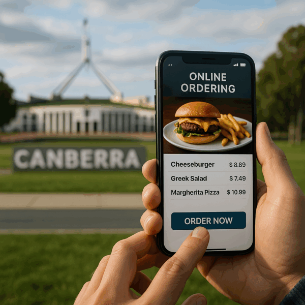
Capital and Canberra Region food businesses: take orders, payments, and pre-orders online with a food order website built to boost sales and cut wait times.

Serialisation can help authors prove reader interest to publishers before a novel is published by releasing serialised chapters through WordPress and PDQ, with a simple