
Blog
What You Get When You Pay for a Professional Website Build
Know exactly what’s included in a professional website build, what costs extra, and how to avoid surprise fees, and vague promises.
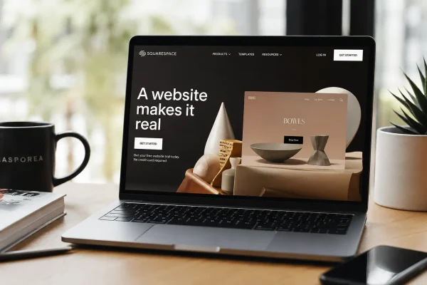
Squarespace is a sensible choice for small business owners who want to get a website online without hiring a developer straight away. It gives you templates, layouts, images, pages, forms, ecommerce features and enough flexibility to create something that looks professional.
That is why so many business owners use it.
A DIY website often begins with momentum. You pick a template, add your logo, write a few pages, connect your domain and publish. For a new business, that can be a smart move. It gets you out of planning mode and into market. It gives people somewhere to go when they hear about you. It makes the business feel more real.
Your problems usually start after the first version goes live.
Your site that was good enough to launch is not carrying the business. The gaps become harder to ignore. The homepage no longer explains the offer properly. The services have changed, but the website still describes the old version of the business. The copy is too broad. The images do not quite fit. The mobile version feels rough. The contact form works, but the enquiry path is clunky. Google Analytics might be connected, but no one is using it. Search engine settings were filled in once and then left alone.
All of these are pointers to the fact that your site needs attention.
A Squarespace Tune Up suits business owners who have already done the hard part of getting their site online, but now want it to work better. Not a full rebuild but a practical improvement process that treats the site as a business asset, not a decoration.
A good Tune Up starts by looking at the website from the outside. Most DIY sites are built with the business owner’s knowledge baked into them. The owner knows the services, understands the shorthand, remembers why each page was added and knows where everything lives.
A new visitor has none of that context.
They arrive with a problem, a question or a bit of curiosity. They are trying to work out whether they are in the right place, whether the business can help, whether it feels credible and what they should do next. If the site makes them decode vague headings, hunt for basic information or guess the next step, they leave.
That is not only a design problem. It is a clarity problem.
For many Squarespace sites, the homepage is the best place to start. A polished template can hide weak messaging. The first section might have a good image and a neat headline, but still fail to say what the business does. Phrases like “helping you thrive” or “solutions for modern businesses” may sound tidy, but they do not help a visitor decide.
A stronger homepage says what the business does, who it helps, where it operates and what the next step is. For a local service business, that might mean being specific about Canberra, Queanbeyan, Googong and the surrounding region. For a consultant, it might mean explaining the problem they solve rather than listing broad capabilities. For an online store, it might mean making the product range, delivery details and trust signals easier to find.
That kind of improvement can make a website feel more professional without changing the whole design.
Service pages often need the same attention. Many DIY Squarespace websites rely on one general services page with short blocks of text. That can be enough when a business is new, but it becomes limiting once the business needs to rank in search, explain its value clearly or attract better-fit enquiries.
A good service page does more than name the service. It gives the visitor enough confidence to act. It explains the problem, who the service suits, what is included, what the process looks like and what outcome the client can reasonably expect. That does not mean dumping more copy onto the page. It means giving the page a proper job.
Calls to action are another weak spot. Many small business websites are too vague about what should happen next. A button that says “Learn More” is not always wrong, but when every button says the same thing, the site starts to feel generic. A stronger site uses calls to action that match the visitor’s stage of decision-making. Someone ready to talk should see a clear enquiry or booking option. Someone still comparing providers may need a service page, example work, pricing guidance or answers to common questions.
A Squarespace Tune Up can tighten that path. It can make sure the important buttons are visible, the contact page is not doing too much, the forms ask the right questions and the booking or enquiry process works properly on desktop and mobile.
Mobile needs its own review because this is where many DIY sites fall apart without the owner noticing. Squarespace templates are responsive, but responsive does not mean every page looks good after real content has been added. Long headings can wrap badly. Images can crop faces or products in awkward ways. Sections that look balanced on a laptop can feel stretched or crowded on a phone. Buttons can appear too late. Important information can sit below too much introductory copy.
For a local business, a poor mobile experience can cost enquiries. A potential customer searching on their phone may be ready to call, book, visit or compare. If the site feels awkward, that opportunity can disappear with no warning.
Search is another area where Squarespace gives you tools, but not the judgement to use them well. The platform cannot know which services need their own pages, which local search terms are worth targeting, which headings are too vague or which content gaps are holding the business back.
A Tune Up can deal with the practical SEO foundations. Page titles can be rewritten so they describe the service properly. Meta descriptions can be improved so search results make sense. Headings can be cleaned up. Image descriptions can be added. Page URLs can be reviewed. Internal links can be improved so related content supports itself. Local signals can be strengthened so the business is not accidentally presenting itself as generic.
For businesses in the Capital Territory region, that local clarity is useful. A Canberra region business does not need to sound like a faceless national provider if most of its clients are local. Location, service area and practical context should appear naturally across the site.
Design can be improved without turning the job into a full redesign. DIY websites often become visually inconsistent as pages are added over time. One page uses one image style, another uses a different layout, another has too much spacing, another feels cramped. Fonts, colours, button styles and section layouts may all be acceptable on their own, but together they can make the site feel less mature than the business behind it.
The fix is not always more design. Often it is more restraint. Fewer layout styles. Better image choices. Cleaner section breaks. More consistent spacing. Clearer hierarchy. The aim is to make the site feel considered, not overworked.
Content needs the same kind of review. Business owners often write their own website copy while trying to sound professional. The result can be copy that is accurate but not persuasive. It explains the business in broad terms, but does not give the reader enough reason to act.
Good website copy should sound like the business knows who it is talking to. It should answer the questions customers are already asking. It should remove friction. It should make the offer easier to understand. In a Squarespace Tune Up, copy improvement can be one of the most useful parts of the work because clearer words can improve the site before any visual change is made.
There is also the dull housekeeping that many site owners avoid. Broken links, outdated forms, old announcements, missing privacy pages, untested integrations, unused pages, poor image sizing and disconnected analytics can sit in the background for months. On their own, these issues may seem minor. Together, they make the website less reliable.
A Tune Up gives the business owner a reason to deal with them properly.
For ecommerce sites, the opportunity is even more direct. Product pages may need better descriptions, clearer images, stronger trust signals, simpler categories, improved checkout flow or better abandoned cart thinking. A store can look attractive and still make buying harder than it needs to be. In that case, the work is not about making the store prettier. It is about removing hesitation.
For appointment-based businesses, the same logic applies to bookings. If the site uses scheduling, the booking path should feel simple. The visitor should understand what they are booking, how long it takes, what it costs if pricing is shown, what happens afterwards and how to change or cancel if needed. Confusion at that point can cost an enquiry.
The best version of a Squarespace Tune Up is practical and contained. It should not make business owners feel as though their site is terrible. Most DIY sites have value in them. The owner has already made decisions, written content, gathered images and built a starting point.
Asporea Digital’s role is to bring outside judgement, technical experience and marketing discipline to what already exists.
A business owner who built their own Squarespace site may not be ready for a full custom website. They may not have the budget, time or need for that yet. But they may be ready to pay for expert help that improves what they already have. A Tune Up gives them a sensible middle option.
You do not need to throw the site away. You need to make it sharper.
For Asporea Digital, this could become a useful service because it meets small business owners where they are. Many do not want to be lectured about platforms. They want someone to look at their site and say, clearly, what needs fixing, what can stay, what should be improved first and what is likely to make a commercial difference.
That is much easier to buy than a vague website review.
A strong Tune Up offer could include a website audit, priority recommendations and a set number of practical improvements completed inside Squarespace. The client gets more than advice. They get visible change. Better copy. Cleaner layouts. Stronger calls to action. Fixed mobile issues. Improved SEO basics. A clearer path for visitors to enquire, book or buy.
The result is not just a nicer website. It is a website that better reflects the business as it is now.
For a small business owner, that can be the real value. Their Squarespace site may have helped them start, but now it needs to support the next stage. A Tune Up gives them a way to improve the site without starting again, wasting the work they have already done or getting dragged into a larger project before they are ready.
A DIY website is often not broken.
It is unfinished.
Asporea Digital can help finish it properly.
Know exactly what’s included in a professional website build, what costs extra, and how to avoid surprise fees, and vague promises.

Practical digital learning for business owners. Start with Asporea Digital Academy’s free course on why your website isn’t ranking.

9 signs you’re ready to build a membership site and turn your content into a structured, income generating online business.