Most people don’t wake up craving your checkout. They want a result. Your job is to guide them from “hmm, maybe” to “that’s the one” without drama. A clear path to purchase is simply good manners online: help people find the right product, feel confident about the decision, and pay without fuss.
Start with what customers are trying to do
Think like a shopkeeper. Why did they walk in? Are they replacing something broken, buying a gift, or treating themselves? Open each key page with one short line that says who it’s for and what they can do next. If a first-time visitor can’t see their next step in two seconds, they’ll drift.
Make finding easy and obvious
Menus should use everyday words, not internal labels. Fewer choices beat clever wording. Put search where eyes naturally go and make it forgiving of misspellings. If you sell a lot of options, show simple filters that match how people choose in your category: size, use case, budget, colour. Every filter should feel like progress.
Turn product pages into decision pages
People buy outcomes, not features. Lead with the benefit in a sentence or two, then back it up with details. Show photos that answer real questions: how big is it, what does it look like in a normal home, what comes in the box. If customers often ask about compatibility, sizing, or care, answer it on the page. Don’t make them hunt.
Put trust in plain sight
Trust is earned in small moments. Show recent reviews where the eye lands, not hidden at the bottom. Be open about delivery timeframes, returns, and warranty on the product page itself. If you care about quality, say how you check it. If you’re local, say where you ship from. People relax when you remove unknowns.
Be crystal clear on price and delivery
Nobody enjoys surprises at the till. Show the full price early and how delivery will be calculated. If you offer free shipping over a threshold, make that visible before the basket. A quick delivery estimator on the product page can lift conversion because it answers the “when will it arrive” question before it becomes a worry.
Keep the basket moving
The basket is a stepping stone, not a lounge room. Remind shoppers what’s inside, confirm the total, and make the next step the most obvious button on the page. If you suggest extras, keep them genuinely helpful and easy to add or ignore. Save the basket if someone steps away. Life happens.
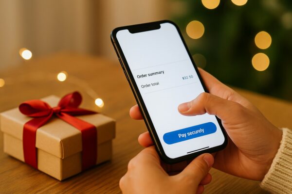
Make the checkout calm
Ask for only what you truly need. Keep it to three ideas: contact, delivery, payment. Offer guest checkout first and the option to create an account after purchase. Use clear labels and show the running total the whole way through. Put a one-line reminder of your returns policy near the pay button. Confidence goes up, drop-off goes down.
Close the loop after the sale
The thank-you page should feel like a receipt and a reassurance. Confirm what was ordered, where it’s going, and when to expect it. Send an email that says the same. If anything will ship later or separately, say so immediately. Fewer “where is my order” messages, happier customers.
Improve without the jargon
You don’t need a degree in analytics to spot friction. Watch a few real sessions or ask a friend to buy something while you observe. Where do they hesitate, scroll back, or leave the page? Tidy those moments first. Change one thing at a time and check the numbers weekly. Small fixes compound.
Five quick wins for the next 30 days
-
Rewrite the first line on your top five pages to say who they help and what to do next.
-
Put delivery, returns, and warranty snippets on your top 20 product pages.
-
Add a simple delivery estimate before checkout.
-
Shorten the checkout to the essentials and enable guest checkout.
-
Send a warmer order confirmation that answers common questions up front.
If this feels like common sense, that’s the point. The path to purchase works best when it’s so smooth that nobody notices it.