
Blog
Set Your Direction for 2026 With a Simple Year-End Reflection
A simple year-end reflection helps you shape clear, confident business goals for 2026. Start with three questions.
TL;DR:
- Mobile usability directly impacts Canberra small businesses’ online conversions and customer engagement.
- Building a mobile-friendly site requires fast load times, thumb-friendly navigation, and clear calls to action.
- Regular testing on real devices and ensuring action-focused features boost local bookings and inquiries.
Losing a local customer because your website is slow or awkward on a phone is a quiet but costly problem. Canberra small businesses face this every day: a potential client searches on mobile, lands on your site, struggles to find your phone number or booking form, and simply leaves. No second chance. Mobile usability directly shapes whether a visitor books, calls, or buys. This guide walks you through every practical step, from planning and building to testing and optimising, so your website works properly for Canberra customers on any device and turns more visits into real enquiries and sales.
| Point | Details |
|---|---|
| Conversion-ready design | Mobile websites must focus on easy bookings, purchasing, and contacting to win local customers. |
| Technical best practices | Correct viewport meta tags, tap target sizes, and accessible zoom are critical for usability. |
| Streamlined bookings | Simplified booking forms and visible CTAs drive conversions on mobile for Canberra businesses. |
| Testing for results | Regular testing on multiple devices ensures your website works smoothly for all local users. |
Now that we understand why mobile-friendly websites matter, let’s take stock of what Canberra business owners need to get started.
Before you write a single word or choose a colour palette, you need clarity on two things: who your mobile visitors are, and what action you want them to take. For most Canberra small businesses, that means local residents searching on their phones for services, products, or appointment availability. A tradie in Belconnen, a physio in Woden, a café in Braddon: each has a different conversion goal, but the same underlying challenge. Mobile visitors are busy, often on the move, and quick to leave if something feels awkward.
Start by identifying your primary conversion goal. Is it a phone call, a booking form submission, an online purchase, or a direction click to your physical location? Once you know that, every design decision becomes easier to make.
Here are the essential features your mobile site must include from day one:
The table below shows the difference between a minimum viable mobile site and one that is truly action-ready for Canberra customers.
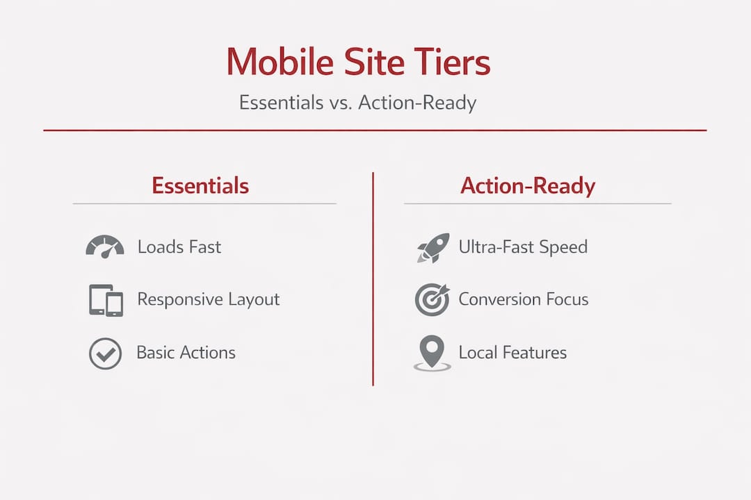
| Feature | Minimum requirement | Action-ready enhancement |
|---|---|---|
| Page load speed | Under 5 seconds | Under 2 seconds |
| Navigation | Hamburger menu present | Simplified 4-item menu, thumb-friendly |
| CTA placement | Somewhere on the page | Above the fold, high contrast button |
| Contact details | Footer only | Sticky header with click-to-call |
| Booking form | Desktop form | Mobile-optimised short form |
| Local signals | Address in footer | Map embed, suburb callout above the fold |
As Google Ads Help advises, you should simplify navigation and speed while ensuring key actions like click-to-call and local information are easy to complete on small screens. This is not just good practice; it directly affects whether your advertising spend and organic traffic converts into real business.
Review Canberra website design tips for local-specific guidance on layout priorities, and explore affordable website service options that suit different business sizes and budgets in the Capital Territory region.
Pro Tip: Place your most important conversion element, whether that is a booking button or a phone number, in the top section of your mobile page. Many Canberra visitors decide within the first few seconds whether to engage or leave. Give them a clear reason to stay and act immediately.
Once you’ve planned your website, it’s time to build and optimise key features that deliver results on mobile.

Building a mobile-friendly site is not about applying a few visual tweaks. It is a deliberate sequence of decisions that stack on top of each other. Miss one step and the whole experience can feel off, even if it looks fine on a desktop monitor.
Follow these steps carefully:
Choose a mobile-first platform. WordPress with a well-built theme, or a reputable page builder like Elementor or Kadence, gives you solid responsive foundations. Avoid drag-and-drop builders that generate bloated code, as they tend to load slowly on mobile.
Enable responsive design from the start. A responsive design automatically adjusts layout, font sizes, and image dimensions based on screen width. Confirm your chosen theme is fully responsive before building any content.
Set the correct viewport meta tag. This small piece of HTML tells the browser how to scale your page on mobile. Without it, your site may render as a shrunken desktop page. Critically, the correct viewport tag should not include "maximum-scale=1oruser-scalable=no`, because blocking user zooming creates accessibility issues and hurts mobile usability.
Optimise images before uploading. Uncompressed images are the single biggest cause of slow mobile pages. Use WebP format where possible, compress files to under 100KB for most images, and use lazy loading so images only load when the visitor scrolls to them.
Simplify your navigation. On mobile, limit your main menu to four to five items maximum. Use a hamburger icon that is large enough to tap easily. Avoid dropdown sub-menus on mobile; instead, consider a separate simplified menu structure.
Place CTA buttons strategically. Every key page should have a CTA button visible within the first screenful of content. Use high-contrast colours, sufficient padding, and clear action-oriented text like “Book now” or “Call us today.”
Test on real devices during the build. Emulators are useful but not perfect. Test on actual iPhones and Android handsets at different stages of the build so you catch layout issues early.
The table below captures common mistakes we see on Canberra business websites alongside the recommended fix.
| Common mistake | Recommended fix |
|---|---|
| Missing viewport meta tag | Add correct viewport tag in theme header settings |
| Slow pages due to large images | Compress images, use WebP format, enable lazy load |
| Tiny CTA buttons hard to tap | Minimum 44×44 CSS pixels, clear contrast |
| Cluttered mobile menu | Limit to 4-5 items, remove dropdown sub-menus |
| Desktop-only forms | Rebuild forms with fewer fields for mobile |
| Font too small to read | Minimum 16px body font size |
Solid website speed improvement practices are a good complement to your mobile build process. For a broader look at how design choices affect revenue, smart web design for sales offers practical Canberra-focused insights. Google’s own mobile UX guidance reinforces that speed and action simplicity are non-negotiable for converting mobile visitors.
Pro Tip: After you build each page, switch your browser to mobile view and try to complete the main conversion action yourself. If you find it fiddly or unclear, your customers will too. This self-test catches more issues than any automated tool.
With your site built, it’s time to focus on how bookings and conversions happen seamlessly for Canberra customers on mobile.
Having a technically sound mobile site is only the beginning. The real measure of success is whether local visitors complete the action you want. For Canberra service businesses, allied health providers, and trades, that usually means a booking or a phone call. And mobile UX action readiness is what separates a site that generates enquiries from one that simply looks presentable.
“Mobile UX is not just about layout. It is about action readiness: click-to-call, local options above the fold, and simplified forms so visitors can complete bookings or purchases without friction.” — Google Ads Help
Think about the journey a Canberra resident takes when searching for, say, a local physio on a Saturday morning. They are on their phone, possibly in a hurry. They find your site, scan the page quickly, and look for a way to book. If your booking form has ten fields and requires scrolling through three screens, many of them will simply close the browser and try the next result.
Here are the top conversion features your Canberra mobile site should include:
Physical tap targets deserve special attention. According to mobile SEO best practice, tap targets should be at least 44×44 CSS pixels with approximately 8px spacing between them. When buttons and links are too close together, visitors tap the wrong element, get frustrated, and leave. This is a simple fix with a significant impact on conversion rates.
Explore dedicated booking functionality for Canberra businesses to understand how booking integrations can automate your appointment process. Pairing good booking tools with modern website design ensures the visual experience matches the functional one.
Pro Tip: If your business serves specific Canberra suburbs such as Tuggeranong, Gungahlin, or the inner north, mention them near your booking CTA. Local specificity reassures visitors that you are nearby and available, which can lift bookings meaningfully.
When you’ve made your optimisations, it’s essential to verify that your website is truly mobile-friendly and catch any issues before they impact local customers.
Many Canberra business owners build or update their website, check it looks fine on their own phone, and assume the job is done. That approach misses a lot. Different devices, screen sizes, and browsers can render your site differently. A systematic testing routine is what gives you genuine confidence.
Follow these steps to test your mobile website thoroughly:
Run Google’s Mobile-Friendly Test. Enter your URL at Google’s testing tool and review the results. The report flags issues such as text too small to read, content wider than the screen, and clickable elements too close together.
Check the viewport meta tag manually. View your page source and confirm the viewport meta tag is present and does not include user-scalable=no or maximum-scale=1, as the mobile SEO checklist confirms these block user zooming and create usability problems.
Test on multiple real devices. Borrow or use an Android phone and an iPhone if possible. Check different screen sizes, from compact 5-inch handsets to larger 6.5-inch models. Pay attention to how text wraps, how images scale, and whether buttons are easy to tap.
Check tap target spacing. Navigate every clickable element on your site using your thumb only. If you accidentally tap the wrong link or button more than once, the spacing needs adjusting. Following thumb-friendly design principles reduces these errors significantly.
Test your booking and contact forms end to end. Fill in and submit every form on your site from a mobile device. Check the confirmation message appears, verify the notification reaches your inbox, and confirm the process takes under 60 seconds. If it takes longer, simplify.
Check page load speed on mobile. Use Google PageSpeed Insights and review the mobile score specifically. Aim for a score above 70. Pay attention to Core Web Vitals, particularly Largest Contentful Paint, which measures how quickly the main content loads.
Review website updates for 2026 for practical ideas on bringing an older site up to current standards. The web design tips for small business guide also covers common pitfalls that affect local search visibility and conversion.
Pro Tip: Schedule a brief monthly mobile check as part of your regular business routine. Websites drift over time as plugins update and content is added. A small, steady habit of reviewing your mobile experience is far easier than fixing a broken site after you’ve already lost enquiries.
Most guides focus on layout grids, responsive breakpoints, and page speed scores. These things matter. But there is a quieter, more commercially significant issue that rarely gets the attention it deserves: form friction.
We see it consistently with Canberra businesses. A site might pass every technical mobile test and still convert poorly because the booking form is too long, the fields are too small to type into comfortably, or the confirmation step is confusing. Visitors who genuinely wanted to book simply give up. The site looks fine in reports but loses business every week.
The other missed opportunity is local specificity on mobile. Canberra has distinct suburbs and communities, and mobile searchers often include location terms in their searches. A site that mentions Phillip, Bruce, or Kingston near a CTA or service description connects more directly with that searcher’s intent. It signals relevance. Combined with a simplified booking journey, this kind of local touch can lift enquiry rates noticeably without any additional traffic.
Quick phone number access is another underestimated factor. Many Canberra service business clients told us they book by calling rather than filling forms. If your phone number is buried in the footer, you are losing those calls. A click-to-call button in a sticky header or floating bar recovers them. It is a simple addition that pays for itself quickly.
The broader lesson is that technical compliance is not the same as conversion readiness. True mobile success means thinking like a Canberra customer who is already slightly impatient, probably outside, and ready to act if you make it easy. Good branding through website design supports this by making the experience feel trustworthy and local, not generic.
After learning the practical steps and expert perspective, Canberra businesses can take action with affordable, tailored solutions.
Building a mobile-friendly website that genuinely converts does not require a large budget or a complicated process. What it does require is a clear scope, the right platform, and someone who understands both local business needs and the technical details that make a site perform well on mobile.
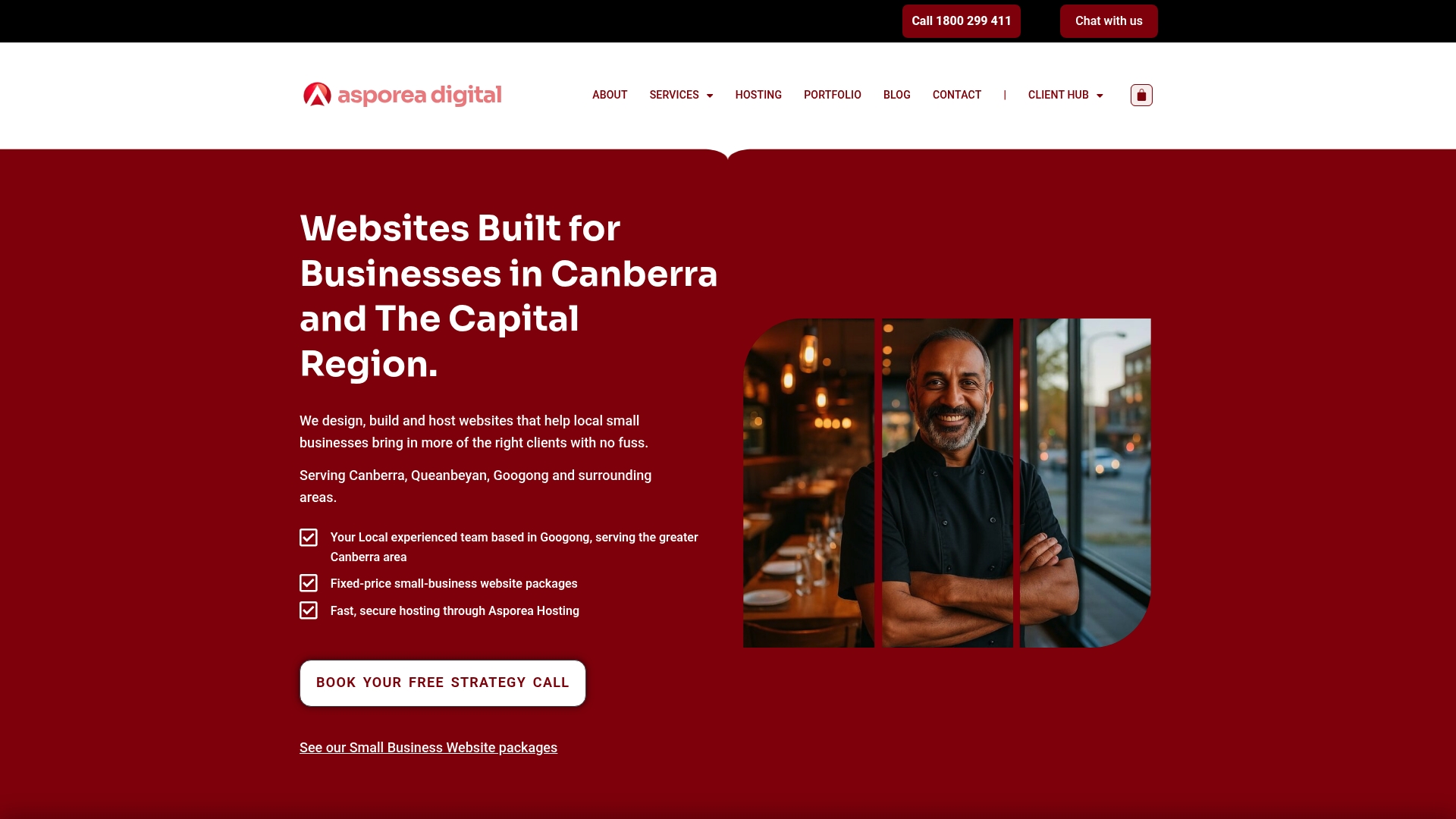
Asporea Digital builds fixed-price WordPress websites for Canberra small businesses, with mobile optimisation built into every project from day one. Whether you need a clean brochure site, an online booking system, or a WooCommerce store, each build is designed to load quickly, navigate easily on mobile, and turn local visitors into genuine leads. Using WordPress for digital marketing gives your business a flexible, scalable foundation. Explore smart web design solutions built around sales outcomes, or see how modern website design growth strategies are helping local businesses build steady momentum in 2026.
The most vital feature is action readiness, which means making it easy for visitors to book, call, or buy directly from their mobile device. Google confirms that click-to-call and simplified forms above the fold are the highest-impact mobile elements for local businesses.
Use Google’s Mobile-Friendly Test and manually check tap targets, zoom accessibility, and form usability across multiple real devices. The mobile SEO checklist confirms you should verify the viewport meta tag is correctly configured and does not block user zooming.
Tap targets should be at least 44×44 CSS pixels with around 8px spacing between them to avoid the common clickable elements too close together issue flagged by Google’s mobile usability checks.
Yes, mobile booking forms should be simplified with fewer fields and minimal scrolling to reduce friction and lift conversions. Google’s mobile UX guidance recommends making key actions easy on small screens so visitors complete bookings without abandoning the process.
A simple year-end reflection helps you shape clear, confident business goals for 2026. Start with three questions.
PDQ makes it easy to add subscribers from your website forms to newsletter lists without messy exports or costly platforms.

A newsletter keeps you in touch with interested visitors. Stay useful, stay remembered, and bring people back to your website when they’re ready.