Blog
Your Contact Page Should Feel Like an Open Door
Many websites lose leads on the contact page. Uncover the most common mistakes and how to design a page that builds confidence and action.
TL;DR:
- A well-designed homepage quickly builds trust by clearly presenting your value proposition, navigation, and call-to-action. It balances aesthetics, usability, and performance by prioritizing content, optimizing images, and ensuring accessibility standards are met. Structuring content with semantic HTML and schema markup improves visibility to search engines and AI tools, increasing inquiry and engagement.
Your homepage is defined by one job: turn a stranger into someone who trusts you enough to take the next step. Effective homepage design is the practice of organising key information, visuals, and navigation so your business value is clear the moment a visitor arrives. For small business owners in Canberra and across Australia, getting this right is not a luxury. It directly shapes whether a visitor books, enquires, or leaves. Tools like Google Analytics reveal how quickly people leave your site, and the numbers are often confronting. This guide walks you through every layer of a homepage that actually works, from structure and aesthetics to technical performance and SEO.
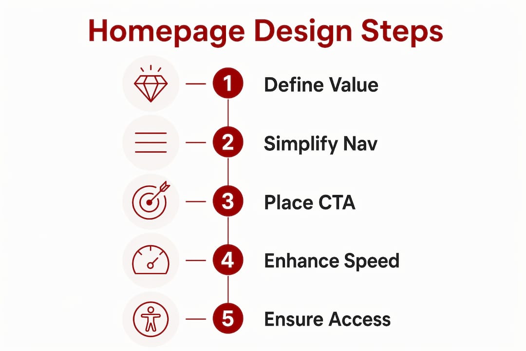
A homepage that works for your business rests on five foundational elements, and missing even one of them creates friction that costs you enquiries. According to Webflow’s homepage design research, a 5 to 7 item navigation menu, a strong call-to-action, clear headlines, and concise service summaries form the core of any effective layout. Each element earns its place by guiding the visitor toward a decision.
Here is what every small business homepage needs:
Pro Tip: Place your most important CTA above the fold on both desktop and mobile. Visitors should never need to scroll to find out how to contact you.
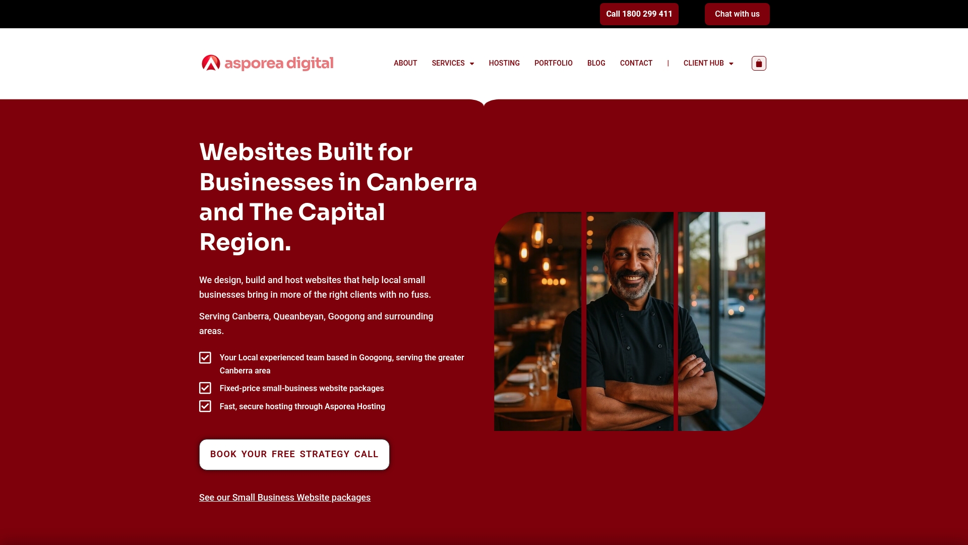
Reviewing successful small business website examples from Canberra shows a consistent pattern: the businesses generating steady enquiries keep their homepages focused, not feature-packed.
Visual appeal and fast load times are not competing priorities. They are both requirements, and the good news is that the design choices that improve speed also tend to improve usability.
Jakob Nielsen’s principle of aesthetic and minimalist design is the clearest framework for this balance. It states that every visual element that does not serve a purpose actively harms the user experience by adding noise. For a small business homepage, this means resisting the urge to fill every section with graphics, animations, and rotating carousels.
Here is a practical sequence for getting the balance right:
Colour contrast is a performance issue of a different kind. WCAG 2.2 requires a minimum contrast ratio of 4.5:1 for normal text and 3:1 for large text. This matters because 83.6% of homepages failed accessibility contrast checks in 2025, making it the most common WCAG violation. Fixing contrast is usually a ten-minute task in your colour settings, and it immediately improves readability for every visitor, not just those with low vision.
Pro Tip: Use the WebAIM Contrast Checker (a free browser tool) to verify your text and background colour combinations before you publish. Aim above the 4.5:1 minimum to give yourself a comfortable margin.
For more on reducing homepage payload and improving load speed, the site speed guide from Asporea Digital covers practical techniques suited to WordPress sites.
Two homepages can look identical in a browser and perform very differently in search results. The difference is almost always in the underlying structure, not the visual design.
Search Engine Journal’s machine-first architecture recommends deciding what information your page must expose before finalising the design. For a small business homepage, that means your business name, location, core service, and primary CTA must exist as readable text in the HTML, not embedded inside an image or a JavaScript-rendered element that search engines and AI assistants cannot reliably read.
| Structural element | What it does for search and AI visibility |
|---|---|
| Semantic HTML headings (H1, H2) | Signals content hierarchy and topic relevance to search engines |
| Descriptive alt text on images | Makes visual content readable for Google Image Search and screen readers |
| Schema markup (LocalBusiness) | Tells Google your business name, address, phone, and hours explicitly |
| Meta title and description | Controls how your page appears in search results |
| Plain-text contact details | Allows AI assistants and voice search to surface your business accurately |
Homepage structure optimised for AI and search engines is now a core element of digital marketing strategy, not an optional technical add-on. Voice assistants and AI tools like Google’s AI Overviews pull answers from pages with clear, explicit data. If your address is only inside a Google Maps embed, it may not be read at all.
For Canberra service businesses in particular, the features of effective service websites guide explains how to structure content so both people and machines can find what they need quickly.
Working through a structured checklist before you launch or update your homepage prevents the small oversights that quietly cost you leads. Use this sequence as your standard review process.
Pro Tip: Schedule a homepage review every six months, not just at launch. Business details change, offers evolve, and what worked in 2024 may not reflect your current positioning.
Common mistakes to avoid include overcrowding the page with too many sections, using multiple competing CTAs that confuse the visitor about what to do next, and relying on low-contrast text over photographic backgrounds. Each of these errors is easy to introduce and easy to miss if you are too close to your own site.
A homepage that converts visitors into leads requires clear structure, fast load times, accessible design, and content that search engines and AI tools can read and use.
| Point | Details |
|---|---|
| Lead with your value proposition | Your headline must answer what you do and who you serve within three seconds. |
| Keep navigation to 5 to 7 items | Plain-language, task-oriented labels reduce confusion and improve conversions. |
| Meet WCAG 2.2 contrast standards | A minimum 4.5:1 contrast ratio protects readability and meets accessibility requirements. |
| Optimise for LCP under 2.5 seconds | Compress images, avoid carousels, and use fetchpriority on your hero image. |
| Structure content for machines, not just people | Semantic HTML, alt text, and schema markup make your homepage visible to search engines and AI. |
After working on WordPress websites for small businesses across Canberra, the pattern I see most often is this: business owners spend the most time on the parts of their homepage that visitors spend the least time on. The colour of a button border. The exact shade of a background section. The number of testimonials to include.
The visitors who convert spend their time on the headline, the CTA, and the contact details. That is where your attention should go first.
The most effective small business homepages I have seen are not the most visually elaborate ones. They are the ones where the owner had the discipline to remove things. A Canberra trades business I worked with had a homepage that listed every service they had ever offered, with three different CTAs competing for attention. We stripped it back to one headline, one CTA, and three service categories. Enquiries increased within the first month.
Iterative testing matters more than getting it perfect at launch. Use Google Analytics to track where visitors drop off, and use that data to make one change at a time. Small, steady adjustments over six months outperform a single expensive redesign every time.
The uncomfortable truth is that most homepage problems are not design problems. They are clarity problems. If you are not getting enquiries, the first question to ask is not “does it look good?” It is “does a stranger immediately understand what I do and why they should choose me?”
— James
If you are ready to move from a homepage that exists to one that works, Asporea Digital builds fixed-price WordPress websites for small businesses across Canberra and the Capital Territory.
Every project starts with your business outcomes, not a design template. Asporea Digital handles the structure, speed, accessibility, and SEO foundations so your homepage is built to attract local search traffic and convert visitors into real enquiries. From WordPress and digital marketing integration to ongoing care plans and support, you get one local team managing the whole thing. Explore how modern website design can support your business growth, or get in touch with Asporea Digital directly for a straightforward conversation about your site.
An effective homepage communicates your value proposition clearly, uses a focused navigation of 5 to 7 items, and places a single prominent CTA above the fold. It also loads in under 2.5 seconds and meets WCAG 2.2 accessibility standards.
Navigation best practice recommends 5 to 7 items with plain-language, task-oriented labels. More than seven items creates choice overload and increases the chance a visitor leaves without taking action.
Page speed directly affects both user experience and search rankings. Targeting an LCP under 2.5 seconds, by compressing images and removing heavy scripts, keeps visitors on your page and signals quality to Google.
Use semantic HTML headings, descriptive alt text, LocalBusiness schema markup, and plain-text contact details. These elements allow search engines and AI assistants to read and surface your business information accurately.
Insufficient colour contrast is the most common WCAG violation, affecting 83.6% of homepages in 2025. Check that your text-to-background contrast meets the 4.5:1 minimum ratio using a free tool like the WebAIM Contrast Checker.
Many websites lose leads on the contact page. Uncover the most common mistakes and how to design a page that builds confidence and action.

Web writing is about creating comfort for your visitor. When people feel comfortable and understand what you do, that’s when they choose you.

Startup advice from other startups can sound useful, but experience is what helps shape a clearer, stronger business early.