
Blog
Build the profile before you need it: turning experience into income online
Build your online profile early to turn experience into coaching, courses, mentoring and new income before you need it fast.
Imagine this. A potential customer lands on your website, spends a few minutes looking through what you offer and decides they’re ready to talk. They click “Contact” expecting a quick, friendly way to reach you. But what they find instead is a form that feels more like a chore than an invitation. The phone number is hard to spot, the form asks for too much detail, or worse, nothing happens when they click send. Interest turns into irritation, and the moment passes.
That single moment often decides whether you gain a customer or lose them. The contact page looks simple, but it’s the bridge between curiosity and connection. It’s where people decide if they can trust you enough to reach out.
A contact page is more than a form. It’s a reassurance that there’s someone real on the other side of the screen. When you make it easy to reach you, you make it easy for people to say yes. A phone number near the top shows you’re ready to help. A short, working form gives people confidence. A visible email address says you’re not hiding. These small details are how people decide if they want to do business with you.
Every touchpoint should feel smooth. If someone fills in a form, a simple thank-you message or confirmation email reassures them that their message was received. When those signals are missing, people start to wonder if anyone’s listening.
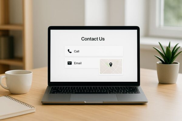
What makes a contact page effective isn’t fancy design; it’s clarity. Visitors should instantly know how to reach you, when you’ll respond and what to expect. A short line like “We reply to all enquiries within one business day” gives people confidence that they won’t be ignored.
It also helps to show a little personality. A warm greeting, a friendly note, or even a short introduction about who they might hear from turns a generic form into a genuine interaction. When people feel like they’re reaching a person, not a process, they’re far more likely to take that step.
Not everyone wants to connect the same way. Some people prefer to type, others want to talk. When your website offers a few clear ways to reach you, it signals flexibility and care. Even something as simple as making your phone number clickable on mobile devices makes a real difference.
Your contact page isn’t there to collect information; it’s there to start a conversation. A form that works every time, a confirmation that feels human, and an open invitation to talk create a sense of ease that visitors remember.
When you think about it, the contact page is one of the smallest parts of your website, yet it carries the biggest weight. It’s where action happens. A clear, friendly page tells people you’re organised, attentive and ready. A confusing one suggests the opposite.
A well-built contact page doesn’t need to shout. It just needs to work, to reassure, and to open the door to real conversation. When people feel that ease, they take the next step.
At Asporea Digital, we help businesses design websites that feel personal, not distant. If your contact page isn’t turning visitors into conversations, it might be time to refresh the way people connect with you online.
Build your online profile early to turn experience into coaching, courses, mentoring and new income before you need it fast.
A handover document gives you access to your site to update, protect, measure and get support without needing anyone else.

Domain scams peak during December. Learn how scammers make their emails look real and how to protect your business with simple, practical checks.