
Blog
Website Handover: What You Should Receive Before You Call It “Done”
A handover document gives you access to your site to update, protect, measure and get support without needing anyone else.
TL;DR:
- Having a mobile-friendly, responsive website is essential for small businesses because it improves search rankings and enhances user engagement. Responsive design employs fluid grids, flexible images, and media queries to adapt seamlessly across all devices, reducing maintenance costs and boosting credibility. Start by auditing your current site, adopting a mobile-first mindset, and working with developers who prioritize genuine mobile responsiveness.
Your website might look polished on a desktop, but if it falls apart on a phone, you are losing customers before they even read your first sentence. Understanding what is responsive web design is one of the most practical things a small business owner can do to protect their online presence. It is not about shrinking a desktop page to fit a smaller screen. It is about building a site that adapts intelligently to any device, giving every visitor a clean, usable experience whether they are on a laptop, tablet, or phone.
| Point | Details |
|---|---|
| Responsive design adapts to any screen | A single website adjusts its layout fluidly across phones, tablets, and desktops without separate versions. |
| Mobile-first indexing affects your ranking | Google prioritises mobile-friendly sites in search results, making responsiveness critical for local visibility. |
| One site beats maintaining two | A responsive site is more cost-effective than running separate desktop and mobile versions long term. |
| Modern techniques go beyond media queries | CSS Grid, Flexbox, and container queries give today’s sites finer layout control across devices. |
| Audit before you redesign | Check your current site’s responsiveness first, then plan improvements around real device behaviour. |
The term responsive web design was coined by Ethan Marcotte in 2010. His original concept rested on three pillars, and they still form the foundation of every well-built responsive site today.
Fluid grids use proportional units like percentages rather than fixed pixel widths. So instead of a column that is always 600 pixels wide, it might be 50% of the screen, shrinking and growing as the viewport changes.
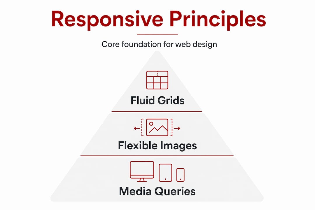
Flexible images scale within their containers. A photo that fills a wide desktop layout will shrink to fit a narrow phone screen without spilling outside the edges or losing proportion.

Media queries are CSS instructions that apply different style rules at different screen widths. They are what tell your site to show a single column on a small phone but a three-column grid on a large monitor.
Modern responsive sites go further than these three original pillars. CSS Grid and container queries now allow components to respond to their own container’s size rather than just the full viewport, giving designers finer control over how individual sections behave. Fluid typography using CSS functions like "clamp()` lets text scale smoothly between sizes without jumping at fixed breakpoints.
There is also the question of approach. Mobile-first design means you start building the smallest, simplest version of your site and layer on complexity as screen size increases. It is a discipline that forces you to prioritise what actually matters to your visitors. Think of it like packing a carry-on bag before a trip. You decide what is truly necessary first, then add if space allows.
Pro Tip: If you use WordPress, choosing a theme built with mobile-first CSS saves you significant rework later. Look for themes that explicitly declare mobile-first development rather than simply claiming to be “responsive.”
Here is a straightforward reality. Mobile searches now make up more than half of all Google traffic. If your site does not work well on a phone, you are invisible to a growing share of people actively looking for what you offer.
Google’s mobile-first indexing means the search engine primarily looks at your mobile site to decide how to rank you. Businesses ignoring mobile optimisation risk both poor SEO performance and a steady loss of mobile traffic. For a Canberra trades business or allied health practice, that translates directly to fewer enquiries.
The engagement numbers are equally sobering. Visitors to a non-mobile-friendly site are five times more likely to leave without taking any action. That is not a technical problem. That is lost revenue.
Responsive web design benefits for small businesses include:
The well-designed website impact on SEO extends beyond mobile friendliness too. Page speed, clear structure, and readable content all contribute to how search engines assess and rank your site.
These three approaches are often confused, and it is worth taking a moment to understand the difference, because the choice has real consequences for your budget and your workload.
| Approach | How it works | Maintenance | Best for |
|---|---|---|---|
| Responsive design | Single codebase, fluid layout that adapts continuously | Low, one site to manage | Most small businesses |
| Adaptive design | Fixed layouts that load at specific breakpoints | Medium, multiple templates | High-traffic, complex sites |
| Separate mobile site | Distinct URL and codebase for mobile visitors | High, two sites to manage | Rarely justified today |
Responsive design uses a single fluid codebase that adapts continuously as the screen width changes. Adaptive design, by contrast, detects the device type and loads one of several pre-built fixed layouts. The visual result can look similar, but adaptive sites require more maintenance because each layout must be updated separately when you change content.
Separate mobile sites (think “m.yourbusiness.com.au”) were common a decade ago but create significant problems today. You end up with two URLs, split SEO authority, and two sets of content to keep current. Redirects can fail. Consistency suffers.
For the vast majority of small businesses, responsive design is the clear, practical choice. Responsive design treats flexibility as a core philosophy, not a technical workaround. That mindset leads to better outcomes across the board.
Pro Tip: When reviewing a web designer’s portfolio, load their example sites on your phone before committing. A site that genuinely adapts its layout, rather than just scaling down, tells you a great deal about how that designer approaches their work.
You do not need to understand CSS to make good decisions about your website’s responsiveness. You do need to ask the right questions and take a few measured steps.
Audit your current site. Open your existing website on your phone and a tablet. Does the text require zooming? Do buttons overlap? Does anything break or overflow? Google’s free mobile-friendly test tool gives you an objective score and flags specific issues.
Adopt a mobile-first mindset. When briefing a designer or reviewing content, think about what a visitor needs to do on their phone first. Often that is finding a phone number, reading a short description, or booking an appointment. Everything else is secondary.
Choose the right platform. WordPress with a quality responsive theme is a strong foundation for most small business sites. It gives you control over content without requiring you to touch code. Look for WordPress customisation examples that show real device adaptability, not just desktop screenshots.
Work with a developer who prioritises mobile. Ask directly whether their builds start from mobile or desktop. Ask to see their work on a phone during your initial conversation. A developer who builds mobile-friendly websites from the ground up will save you significant rework later.
Test across real devices. Browser developer tools simulate screen sizes, but real-device testing reveals issues that simulators miss. Check your site on at least two different phones and a tablet before launch.
Plan for iteration. You do not need a perfect site on day one. Launch with a solid, responsive foundation and refine from there based on how real visitors use it. Small, steady improvements over time create a site that genuinely serves your business.
Pro Tip: Ask your web developer to show you a Google PageSpeed Insights report for a site they have built. Mobile performance scores above 80 indicate genuine care for mobile experience, not just a responsive checkbox.
From my experience working with small businesses on their websites, the biggest mistake I see is not ignoring responsive design entirely. It is treating it as a final checkbox rather than a starting point.
I have seen business owners invest in beautiful desktop designs and then discover weeks before launch that the mobile version is an afterthought. Menus that do not open. Contact forms that are impossible to tap. Text so small that no one can read it without pinching and zooming. These are not minor cosmetic issues. They are barriers between your business and your customers.
What I have learned is that responsive design as a mindset produces better outcomes than responsive design as a task. When you start every decision by asking “how does this work on a phone?” you end up with cleaner layouts, faster pages, and clearer calls to action, regardless of screen size.
I also think the connection between responsive design and branding is underappreciated. A site that feels professional and intentional on mobile tells visitors that your business pays attention to detail. That perception carries over to how people view your services. The impact of web design on branding is far more direct than most business owners realise.
My advice is straightforward. Do not wait for a perfect brief or a large budget. Start with an honest audit of your current site on a phone, identify the two or three most frustrating issues for a visitor, and fix those first. Then build from there with a developer who genuinely understands mobile-first practice.
— James
If reading this has made you look at your own site with fresh eyes, that is a good starting point. Asporeadigital builds fixed-price WordPress websites for small businesses across Canberra and the Capital Territory, with mobile performance treated as a non-negotiable from day one, not an optional extra.
Every site Asporeadigital builds is tested across real devices, optimised for local search visibility, and structured to turn visitors into genuine enquiries. Whether you need a professional brochure site, a booking system, or a WooCommerce store, the focus is always on smart web design that drives results rather than just a good-looking desktop page.
For businesses ready to understand how a properly built WordPress site fits into a broader growth plan, the WordPress digital marketing guide is a practical place to start. Or explore affordable website packages designed specifically for Canberra small businesses.
Responsive web design is a method of building websites so the layout adapts automatically to fit any screen size, from a desktop monitor to a phone, using a single set of code. The original concept relies on fluid grids, flexible images, and CSS media queries.
Google uses mobile-first indexing, which means it ranks your site based on how it performs on mobile. Sites that are not mobile-friendly risk lower search rankings and reduced visibility in local results, which directly affects how many customers find you.
Responsive design uses a fluid layout that adjusts continuously as the screen size changes, while adaptive design loads fixed layouts at specific device widths. Responsive requires less ongoing maintenance because there is only one codebase to manage.
Not always, but it depends on your platform and current setup. If you use WordPress with a modern responsive theme, a skilled developer can make targeted improvements without rebuilding from scratch. Starting with the right foundation saves considerable time and cost.
Open your website on your phone and check whether the layout adjusts without requiring horizontal scrolling or zooming. You can also use web accessibility testing tools or Google’s mobile-friendly test to get an objective assessment with specific recommendations.
A handover document gives you access to your site to update, protect, measure and get support without needing anyone else.
Long-term online success depends on visible trust. See how an established astrology membership site improved conversions by showing real proof and credibility with help from

DIY websites look cheap until you see the real cost: nights, weekends, missed leads, and the rescue job when something breaks.