
Blog
Stop Sending Customers to Social Media
Stop leaking visitors to social media. Make your website hold attention, build confidence, and guide people to enquire, book, or buy.
TL;DR:
- Most service websites fail because they do not provide visitors with quick, clear, and actionable information. Effective sites prioritize clarity, speed, trust signals, accessible design, and minimal forms to increase inquiries. Focusing on these core elements consistently outperforms overbuilding or aesthetic enhancements alone.
Most service websites don’t fail because the business behind them is poor. They fail because the website doesn’t give visitors what they need quickly enough to stay. The features of effective service websites are rarely about having more pages or a flashier design. They come down to clarity, speed, trust, and a clear path to taking action. If your website isn’t generating steady enquiries, this guide will show you precisely where the gap is and what to do about it.
| Point | Details |
|---|---|
| Clarity converts visitors | Your hero section must answer what you do, who it’s for, and what outcome you deliver. |
| Speed is a revenue lever | Even modest improvements to load time directly increase the rate at which visitors make enquiries. |
| Trust signals reduce doubt | Specific testimonials with measurable outcomes outperform generic praise placed anywhere on the page. |
| Accessible design benefits everyone | Meeting WCAG 2.2 standards reduces interaction failures on mobile and improves experience for all visitors. |
| Minimal forms increase completions | Asking only for essential information in your contact form significantly lowers drop-off rates. |
The moment a visitor lands on your website, they are quietly asking three questions. What do you do? Is this for me? What happens if I contact you? If your hero section doesn’t answer all three within a few seconds, most visitors will leave.
Effective hero messaging gives visitors immediate clarity on the service, the audience it serves, and the outcome they can expect. A heading like “Accounting for Canberra tradies who hate paperwork” does this in nine words. It names the service, names the audience, and hints at the relief. Compare that to “Welcome to our firm,” which tells a visitor almost nothing.
A strong above-the-fold section also needs a visible call-to-action (CTA). That might be “Book a free consult,” “Request a quote,” or “Get started today.” The specific wording matters less than its visibility and relevance. Then repeat that CTA at logical intervals throughout the page, not just at the top.
Pro Tip: Test your hero heading by reading it aloud to someone unfamiliar with your business. If they can’t tell you what you do and who you serve within 10 seconds, rewrite it.
Visitors decide quickly based on above-the-fold content, and a confusing first impression rarely recovers further down the page.
Most service business owners think of website speed as a technical concern, something for developers to sort out. The reality is that it has a direct effect on whether visitors stay long enough to enquire.

Research into e-commerce performance found a 3.5% drop in conversions for every 100 milliseconds of additional load time. For a service website that receives steady traffic, that figure compounds quickly. Speed is not a vanity metric. It is a revenue lever.
The three Core Web Vitals worth understanding are:
Practical steps to improve performance include optimising site speed through image compression, removing unused plugins, and using a reliable host with caching enabled. These aren’t complex changes, but they make a noticeable difference to how professional and dependable your website feels.
Speed also matters for mobile-friendly websites, where slower connections are common and patience is short. A site that loads quickly on a phone feels trustworthy before a visitor has read a single word.
Visitors to a service website arrive with reasonable scepticism. They don’t know you yet. They are weighing whether to spend time and money with a business they found online. Your job is to reduce that doubt steadily as they scroll.
Specific, measurable social proof does this far better than vague praise. “Great service, highly recommend” tells a potential client nothing useful. “We booked out our clinic three weeks in advance after the website launched” tells them everything. Real outcomes, real names, and real context give testimonials weight.
Consider what types of social proof are most effective for a service website:
Placement matters as much as content. Don’t bury testimonials at the bottom of the page. Position them near your main CTA, near your pricing section, or anywhere a visitor might feel hesitation. Trust signals work best when they appear exactly where doubt tends to surface.
Pro Tip: Ask clients to be specific in their review. Instead of requesting “a Google review,” ask them to mention one result they saw from working with you. Most people are glad to help when the request is that clear.
Professional design consistency, including consistent fonts, colours, and spacing, also signals reliability. A site that looks polished tells visitors you take your work seriously.
WCAG 2.2 is the current international standard for web accessibility. It sets testable requirements across four principles: perceivable, operable, understandable, and robust. Meeting these standards isn’t just about compliance. It directly improves the experience for every visitor, including those on mobile, those with temporary impairments, and those using older devices.
Two specific WCAG 2.2 criteria have practical impact on service website usability. Focus visibility requires that keyboard users can always see which element is currently selected. Minimum target size specifies that tappable elements like buttons and links should be large enough to activate without errors. Accessibility improvements like these reduce the small frustrations that cause visitors to abandon a page before completing a contact form.
Here’s how key accessibility features compare in terms of user impact:
| Feature | Without it | With it |
|---|---|---|
| Focus visibility | Keyboard users lose track of where they are | Clear navigation for all input types |
| Adequate tap target size | Mobile users mis-tap links or buttons | Reliable interaction on any device |
| Descriptive link text | “Click here” tells screen readers nothing | Context is clear for all users |
| Logical heading structure | Content feels disorganised and hard to skim | Visitors can self-qualify faster |
Clear, predictable navigation also reduces the effort visitors need to find what they’re looking for. Your menu should reflect the most common visitor journeys, not your internal business categories. Accessible design in WordPress supports both usability and broader reach, particularly as more users rely on assistive technology or mobile devices as their primary screen.
A contact form is often the last step between a visitor and a new lead. Many service websites lose enquiries at exactly this point, not because the form is broken, but because it asks too much.
Minimal, well-designed forms that ask only for essential information see higher completion rates. Name, email or phone, and one focused question about what the visitor needs. That’s usually enough to begin a conversation. Every additional field you add introduces another chance for the visitor to pause and reconsider.
Tracking form behaviour gives you a factual picture of where people drop off. Field-level drop-off analysis reveals which questions are causing hesitation. If visitors consistently abandon a form at the “budget” field, you have a real data point, not just a guess. Most analytics tools and form plugins support this kind of measurement with minimal setup.
A few other form practices worth applying:
The form is the conversion point. Treat it with the same attention you give the rest of the page.
Not every trust signal is a testimonial. Some of the most powerful signals are visual, and they work without the visitor consciously noticing them.
Consistent fonts, colours, and spacing across every page signal that the business is organised and reliable. When design elements are inconsistent, even slightly, visitors register a subtle unease. It doesn’t always translate into a conscious thought. It just makes them less likely to take the next step.
Practical design consistency means using the same two or three font styles throughout, maintaining predictable spacing between sections, and ensuring your colour palette is applied systematically. Your logo should sit in the same position on every page. Your CTA buttons should look identical each time they appear.
This doesn’t require a large budget or a complex build. It requires discipline and a clear design system applied from the start. Businesses that understand how website design shapes branding treat visual consistency as a non-negotiable foundation rather than an afterthought.
I’ve reviewed and built enough service websites to notice a pattern. The ones that consistently generate enquiries aren’t always the most visually striking. They’re the clearest. The ones that quietly frustrate visitors and generate silence are often the most polished-looking but the least direct.
Clarity in messaging beats design every time. A plain-looking site that tells visitors exactly what’s on offer, who it’s for, and what to do next will outperform a beautiful site that leaves people guessing.
Speed deserves more respect than it usually gets. Most small business owners know their site “could be faster” but treat it as low priority. What I’ve seen in practice is that speed improvements often produce the quickest and most measurable lift in enquiries. It’s not dramatic, but it’s consistent.
Accessibility is another area where the commercial case is underappreciated. Meeting WCAG 2.2 criteria isn’t about ticking a compliance box. It’s about removing small obstacles that cause real people to leave your site without contacting you. Fix focus visibility. Increase your tap target sizes. Write descriptive link text. These are modest changes with genuine impact.
My honest advice is to resist adding features until the core ones are working properly. More pages, a blog, a live chat widget. None of these help if your hero section is vague, your form asks too much, or your site takes five seconds to load on a phone.
— James
If these features sound like exactly what your website is missing, you’re not alone. Many small business owners in Canberra come to Asporeadigital after years of maintaining a site that looks reasonable but quietly underperforms.
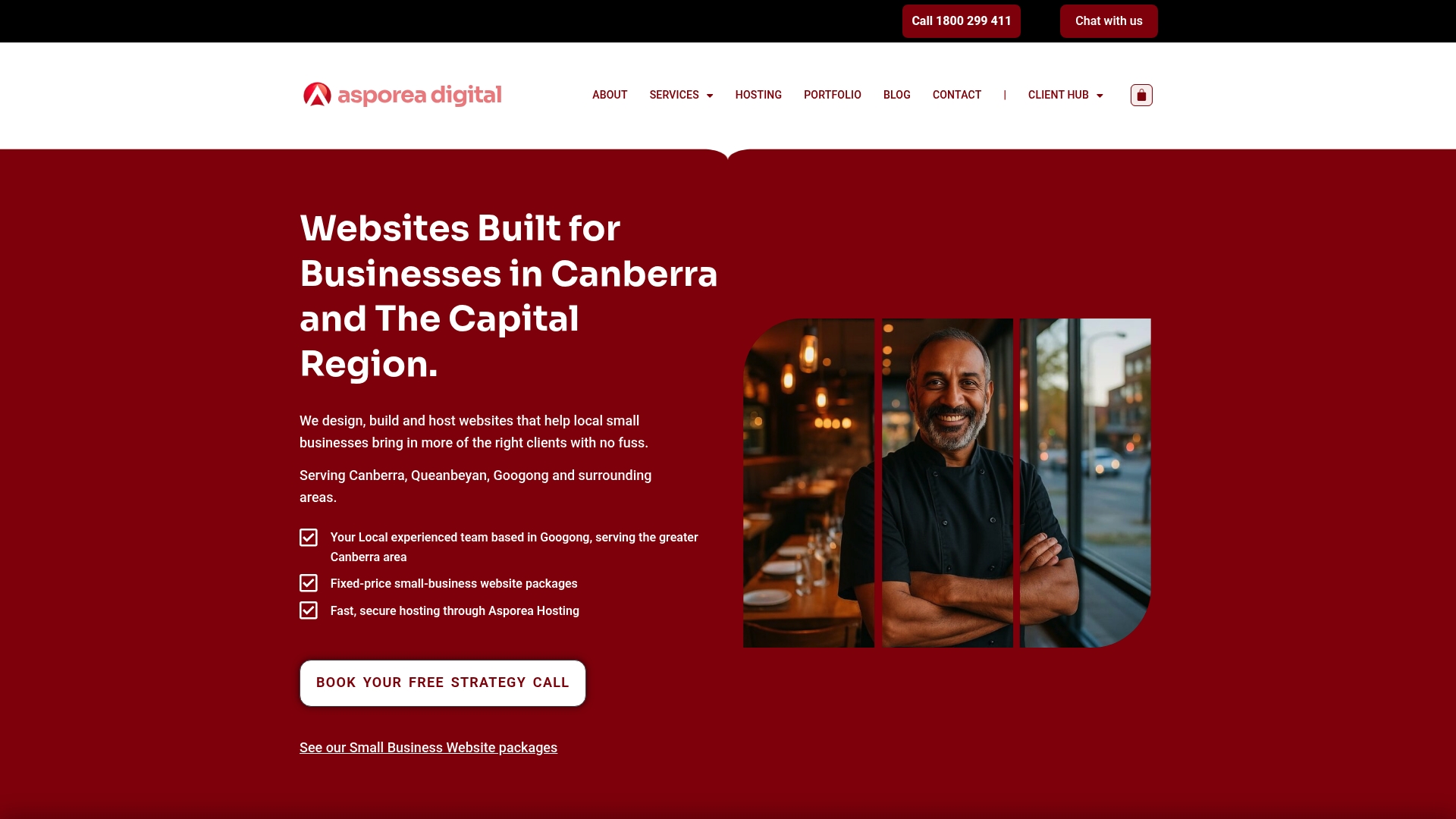
Asporeadigital builds fixed-price WordPress websites designed around the features covered in this guide. Clear messaging, fast load times, trust-building design, and contact forms that actually get used. You can see real Canberra website examples from businesses across trades, allied health, consulting, and hospitality. Each one is built to support steady growth rather than just look good in a browser.
If you’d like to understand how the right website can support your business goals, the fixed-price packages at Asporeadigital are a practical place to start. Clear scope, local support, and a website built around outcomes.
The most important features of effective service websites are a clear value proposition in the hero section, fast load times, visible trust signals, accessible navigation, and a minimal contact form. These elements work together to reduce visitor doubt and increase enquiries.
Research shows that conversion rates drop by roughly 3.5% for every 100 milliseconds of additional load time. A faster site feels more professional and keeps visitors engaged long enough to make contact.
Forms that ask only for essential information, typically name, contact details, and one focused question, see higher completion rates. Tracking field-level drop-off reveals where visitors are abandoning the form.
WCAG 2.2 accessibility features like adequate tap target sizes and visible focus indicators reduce interaction failures on mobile and improve usability for all visitors, not just those with disabilities. Better usability means fewer people leaving before they enquire.
Testimonials are most effective when placed near CTAs, pricing sections, or anywhere a visitor might feel hesitation. Specific outcomes and named clients carry far more weight than generic praise and should be used wherever trust needs reinforcing.
Stop leaking visitors to social media. Make your website hold attention, build confidence, and guide people to enquire, book, or buy.

A simple fix today prevents the slow creep of website issues tomorrow. Stay steady, secure and in control.

Fix your newsletter signup fast. A 2 minute reader test that makes your promise clearer, builds trust, and helps your list grow.