
Blog
Make Your Product and Service Pages Work Harder
Your product page should work like a quiet salesperson that builds trust and converts visitors into buyers. Learn how to write a page that sells
When a website has carried your work for decades, a website change needs a gentle hand.

Jane Teresa Anderson’s site had hosted her writing, podcasts and dream interpretations since the late 1990s. It was rich with wisdom, but the small text and stark palette made reading a little harder than it should be. The challenge was to refresh the experience without losing the search strength or calm authority she’d built over time.
A few simple shifts made all the difference. Larger typography and warmer contrast eased the strain of long reads. A lighter layout brought balance back to her content. And because we rebuilt only the front end in WordPress, every page, ranking and link stayed intact.
What visitors see now is a cleaner, more comfortable space that feels true to Jane Teresa’s voice. The design welcomes reflection rather than distraction, and the site loads quickly across every device. From first brief to launch, the whole refresh took just three weeks.
As Jane Teresa said,
“Delighted to announce my redesigned website… with huge thanks to Justin Tabari and James Williams at Asporea Digital who also designed and built my online learning platform, The Dream Academy, eight years ago.”
You can see the redesign for yourself at https://janeteresa.com
If your own site feels a little dated or heavy to read, there’s a calm way forward — a refresh that keeps your hard-won search position and makes your brand feel renewed.
Let’s talk about how to make that happen.
Your product page should work like a quiet salesperson that builds trust and converts visitors into buyers. Learn how to write a page that sells

Help January customers choose with confidence by aligning your products with what they want at the start of a new year.
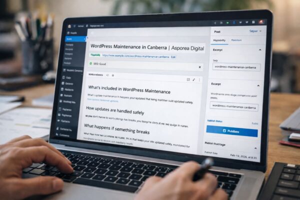
A plain English guide to the WordPress fields that shape what Google shows: permalinks, titles, slugs, headings and excerpts, plus how redirects keep old links