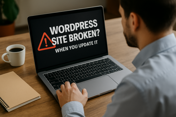
Imagine a customer walking through your shop door and no one serves them for five seconds. They look around, get that awkward feeling, and leave. A slow website does the same thing. Speed is not an IT topic. Speed is customer service at the moment it matters most.
What shoppers feel when your site is slow
People read speed as a signal. Quick sites feel trustworthy and organised. Slow sites feel risky. If the product page dawdles, customers wonder if delivery will dawdle too. That doubt is expensive, because your competitors are one tap away.
Speed also keeps buying momentum. When pages appear instantly, people keep moving from interest to basket to paid. Every extra second is a tiny tax on intent. Remove the tax and more people finish the purchase.
The money side in plain terms
You already pay to bring people to the site. Speed helps you keep them. If your shop converts 2 in every 100 visitors and small speed improvements lift that to 2.3, that is roughly 15 percent more orders without buying extra traffic. Keep the average order value the same and you have a direct revenue lift. Faster sites also lose fewer people at the door, which makes ad platforms smile and can lower your cost per click. You pay less to acquire, and you earn more when they arrive.
Speed protects promotions too. When a sale or new product goes live, fast sites handle the rush. Slow sites creak, carts fail, and goodwill evaporates. Prevention is cheaper than apology.
What actually makes a store feel fast
No code here, just the business view.
First, the first screen counts most. If the title, price, main photo and the add to basket button appear quickly, customers relax. That is the moment trust lands. Everything else can arrive a heartbeat later.
Second, heavy extras are rarely worth it. Pop-ups, chatboxes, discount spinners, review widgets and tracking tags all promise magic. In reality, each one asks the browser to fetch something before your customer can shop. A few of these are useful. Many are not. Fewer, better tools usually means more sales.
Third, pictures sell, but only if they arrive quickly. Big, uncompressed images are the number one culprit in slow shops. Right-size them and your site feels twice as quick without changing a single word of copy.
Finally, your hosting and delivery path matter. Think of it like choosing the right courier. A good delivery network gets your pages close to customers so they do not wait at the counter.
How to talk about this with your developer or agency
You do not need to learn the lingo. Use outcomes.
Tell them you want customers to see the key product information within two seconds on a typical mobile. Ask them to focus on the first screen of each important page and to remove or delay anything that does not help someone decide or buy. Ask for a short list of the slowest features and a recommendation on what to keep, what to fix, and what to bin.
Set a simple house rule: the product page must feel instant and the checkout must be distraction free. If a new add-on slows either, it must earn its place with real results.
A simple 30-day plan for owners
Week one is discovery. Run your homepage and one top product page through GTmetrix and ask for a plain English summary. Do not chase perfect scores. Ask only: what will customers feel first, and what is the quickest fix.
Week two is pictures. Have your team compress and resize images across the site, then deliver them through a content delivery network. Expect a noticeable lift here.
Week three is clutter. Remove or delay pop-ups, unused apps, and extra tracking. Keep what helps a customer choose. Park the rest until after the first screen is visible.
Week four is checkout. Strip it back to the essentials. Offer the payment methods your customers actually use, keep the form calm, and avoid anything that distracts from paying.
At the end of the month, compare sales, bounce rate and add to basket rate with the same period last month. You are looking for a small but clear lift. That lift is proof you can bank.
A quick story to make it real
A regional retailer I worked with had a handsome site that felt sticky on mobile. We changed nothing about the brand or the range. We resized images, removed two pop-ups that were fighting each other, delayed a chat widget until after the first tap, and made the first product photo appear instantly. Conversion improved by a few tenths of a percent. That sounds tiny, yet it added five figures in monthly revenue at their traffic and basket size. No new ads. No redesign. Just less waiting.
How to measure without going down a rabbit hole
Pick three numbers and review them monthly: conversion rate, add to basket rate, and mobile bounce rate. If speed work is working, you will see add to basket rise first, then conversion follow. Use GTmetrix occasionally to spot obvious problems and then ask for the fix in plain English. Treat the waterfall chart like an X-ray. You do not need to be a doctor to see a broken bone.
Common traps to avoid
Do not chase a vanity grade while ignoring what customers feel. Do not add four tools to solve one problem. Do not accept that a beautiful theme must be slow. Do not let the checkout carry anything that is not required to take money safely.
The point of all this
No customer will write to thank you for loading in 1.3 seconds. They will simply buy and come back. When you treat speed as a sales feature, you reduce doubt, earn trust, and get more from the traffic you already pay for. That is why performance belongs on the business agenda, not just in the development workstream.