
Blog
Helping Visitors Like You So They Contact You
Web writing is about creating comfort for your visitor. When people feel comfortable and understand what you do, that’s when they choose you.
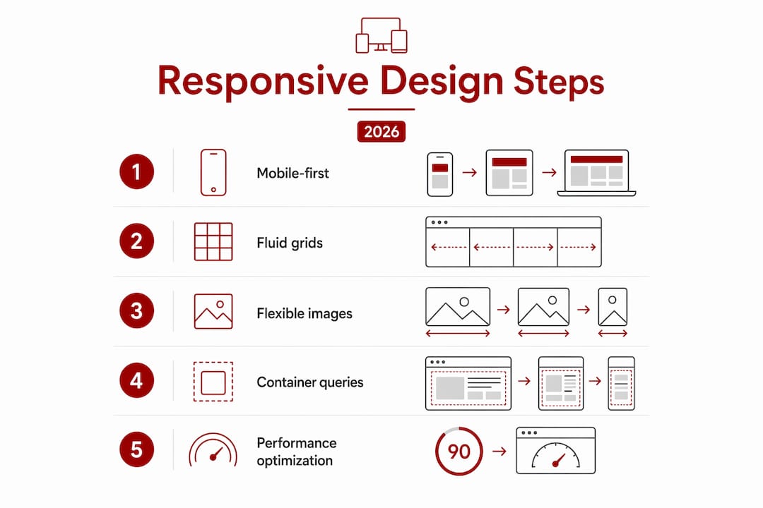
Responsive design is the practice of building websites that adapt fluidly across every screen size, from a 6-inch smartphone to a 34-inch ultrawide monitor. The role of responsive design in 2026 goes well beyond making things look tidy on mobile. It underpins search rankings, accessibility compliance, user trust, and conversion rates across a device ecosystem that now includes foldables, smart TVs, and 5G-connected tablets. Platforms like Elementor and tools built on CSS Grid and container queries have made fluid, adaptive layouts the expected standard, not a premium feature. If your website still relies on fixed breakpoints and desktop-first thinking, it is already behind.
A website in 2026 functions as your brand’s storefront, salesperson, and customer support desk simultaneously. Speed, clarity, and responsive design directly affect how long visitors stay and whether they convert. That means layout decisions are business decisions, not just aesthetic ones.
Usability across devices has become more complex. Your visitors arrive on smartphones, tablets, foldable screens, ultrawide monitors, and smart TVs. Each device presents different proportions, touch targets, and reading distances. A layout that works beautifully on a 1440-pixel desktop can collapse into an unreadable mess on a Galaxy Z Fold or a 21:9 ultrawide display.

Accessibility is the other pressure point. ADA-related website accessibility lawsuits increased by 14% year-over-year in the US by mid-2026. That figure reflects a global shift in legal expectations around digital access. Accessible design, clear contrast, logical heading structure, and touch-friendly navigation, reduces legal risk and expands your audience to include people with visual or motor impairments.
Reduced friction produces measurable results. When a visitor can find what they need without pinching, zooming, or waiting for a slow layout to reflow, they stay longer and trust you more. That trust translates directly into enquiry form submissions, phone calls, and purchases.
Pro Tip: Test your site on a real foldable device or use Chrome DevTools’ device emulator to check your layout at unusual aspect ratios. Most layout failures hide in the in-between sizes that standard breakpoints miss.
The technical approach to responsive design has shifted considerably. Fixed breakpoints, the old method of writing separate CSS rules for 320px, 768px, and 1024px, are no longer sufficient. Fluid layouts using relative units and CSS clamp allow continuous scaling that handles foldable and ultrawide screens gracefully. That prevents the common failure where a layout looks fine at 768px and 1024px but breaks at 900px.
Here is how modern responsive development works in practice:
rem, em, and viewport units (vw, vh) for font sizes, spacing, and layout dimensions. CSS clamp() lets you set a minimum, preferred, and maximum value in a single declaration, so typography and spacing scale fluidly without media query clutter.@container) allow individual UI components to respond to the size of their parent container, not just the viewport. A card component inside a sidebar behaves differently from the same card in a full-width grid, without writing separate CSS for each context.max-width containers and aspect-ratio-aware grid templates address both without extra breakpoints.| Technique | What it solves | 2026 relevance |
|---|---|---|
CSS clamp() |
Continuous font and spacing scaling | Handles every screen size between breakpoints |
| Container queries | Component-level layout adaptation | Enables reusable design systems |
| CSS Grid | Two-dimensional page layout | Replaces float and absolute positioning |
| Mobile-first CSS | Performance on small screens | Sets the correct default context |
| Viewport units | Proportional sizing | Adapts to ultrawide and foldable viewports |
Pro Tip: Use clamp(1rem, 2.5vw, 1.5rem) for body text. This single declaration scales your font size smoothly across every device without a single media query.
Global 5G subscriptions are projected to reach 5.9 billion by 2027. That scale means your site will increasingly be accessed on high-bandwidth connections capable of rendering 3D assets and high-resolution media. Responsive design must account for performance at both ends: fast 5G connections and slower mobile networks in regional areas like Canberra’s outer suburbs.
Responsive design directly affects your search rankings. Search engines prioritise sites that serve users well on mobile devices, meaning a site that breaks or loads slowly on a phone ranks lower than a well-built competitor. Google’s mobile-first indexing means the mobile version of your site is the version that gets crawled and evaluated.
The connection between responsive design and SEO runs deeper than mobile friendliness. Accessible, clearly structured content with logical heading hierarchies and readable text produces stronger user signals. Visitors who can read your content easily stay longer and visit more pages. Those behavioural signals, time on site, pages per session, and low bounce rate, feed back into how search engines assess your relevance.
Responsive design also reduces maintenance overhead. A single codebase that serves all devices means you update content once, not separately for mobile and desktop versions. That saved time can go into producing better content, building local citations, or improving your Google Business Profile, all of which compound your SEO results over time.
For small businesses in Canberra, this matters practically. A well-designed, responsive website that loads quickly and reads clearly on a phone gives you a real edge over local competitors whose sites were built five years ago and never updated. Local search results reward trust signals, and a broken mobile layout destroys trust before a visitor reads a single word.
2026 design trends favour calm, content-first layouts that prioritise function and accessibility over visual complexity. Moving away from heavy animations and excessive gradients is not just an aesthetic preference. It is a performance decision that directly supports both SEO and user experience.
These three terms describe different layers of the same problem, and they are often confused. Understanding the distinction helps you make better decisions about where to invest your development effort.
Adaptive design systems change the UI based on user behaviour, role, location, or task, while responsive design adapts only to device screen size. Generative UI goes further, composing interface elements dynamically using AI and design tokens. In 2026, adaptive and generative layers sit on top of responsive foundations, not instead of them.
| Approach | What adapts | How it works |
|---|---|---|
| Responsive design | Layout and visual presentation | Viewport size triggers CSS rules |
| Adaptive design | Interface behaviour and content | User context, role, or behaviour triggers changes |
| Generative UI | Interface composition | AI assembles components dynamically from design tokens |
Responsive design is non-negotiable as the base layer. You cannot build a useful adaptive or generative interface on a layout that breaks at 768px. The responsive foundation must be solid before any higher-order personalisation makes sense.
For most small business websites, responsive design is the only layer you need to get right. Adaptive and generative UI are relevant for complex applications, e-commerce platforms with large catalogues, or SaaS products with role-based dashboards. A Canberra trades business or allied health practice needs a fast, readable, mobile-friendly site. That is a responsive design problem, solved with good CSS and a clear content hierarchy.
Web designers integrating these layers should treat responsive design as the structural requirement and adaptive behaviour as an enhancement. Build the responsive foundation first. Confirm it works across real devices. Then layer context-aware features on top where they genuinely serve the user.
Responsive design done properly is not just a technical checkbox. It is the difference between a website that wins enquiries and one that quietly loses them to a competitor with a faster, cleaner mobile experience.
Asporeadigital builds fixed-price WordPress websites for small businesses in Canberra and the Capital Territory, with mobile performance and responsive layout built in from the start, not bolted on afterwards. Every site is tested across real device sizes, built on CSS Grid and modern WordPress block themes, and hosted with Asporea Hosting for reliable performance. If you want to understand how a well-built site supports your digital marketing, the WordPress digital marketing guide is a practical starting point. For businesses focused on how design shapes brand credibility, the guide on website design and branding covers the connection directly.
Responsive design in 2026 is the non-negotiable technical foundation for every website that needs to rank, convert, and serve users across a fragmented device ecosystem.
| Point | Details |
|---|---|
| Mobile-first is the default | Write CSS for small screens first and enhance progressively for larger viewports. |
| Fluid scaling replaces fixed breakpoints | Use CSS clamp() and relative units to handle every screen size continuously. |
| Container queries enable reuse | Components adapt to their parent container, not just the viewport, creating flexible design systems. |
| Responsive design drives SEO | Google’s mobile-first indexing means a broken mobile layout directly lowers your search rankings. |
| Accessibility reduces legal risk | ADA-related lawsuits rose 14% year-on-year by mid-2026, making accessible design a business necessity. |
Responsive design is more relevant than ever in 2026. It forms the base layer for all modern web experiences, including adaptive and AI-driven interfaces, and directly affects SEO rankings and user trust.
Responsive design adjusts layout based on screen size using CSS rules. Adaptive design changes the interface based on user behaviour, role, or context, and always requires a responsive foundation underneath.
Container queries allow UI components to respond to their parent container’s size rather than the full viewport. This makes components reusable across different layout contexts without writing separate CSS for each placement.
Yes. Google uses mobile-first indexing, meaning it evaluates the mobile version of your site for ranking purposes. A site that performs poorly on mobile ranks lower, regardless of how it looks on desktop.
The most important techniques are mobile-first CSS, fluid scaling with clamp() and relative units, CSS Grid and Flexbox for layout, and container queries for component-level responsiveness. Together these handle the full range of modern device sizes including foldables and ultrawide monitors.
Web writing is about creating comfort for your visitor. When people feel comfortable and understand what you do, that’s when they choose you.

EOFY pressure? Build website resilience with WordPress updates, 2FA, offsite backups and a restore test so your site keeps selling.

Discover Googong Connect, a new platform bringing residents, businesses and community groups together. Connecting everyone from 2026.