
Blog
The Wake-Up Call Your Website Probably Needs (and the Five-Minute Fix That Saves You Later)
A simple fix today prevents the slow creep of website issues tomorrow. Stay steady, secure and in control.
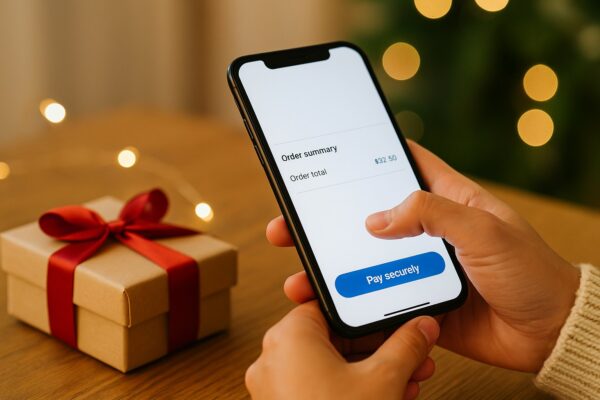
You can tell a lot about a business from its checkout. It is the moment where someone decides whether to keep going or quietly leave. When the path to buying feels smooth, people move confidently. When it feels slow or uncertain, they hesitate. And hesitation is often where the sale ends.
Many owners assume slow sales mean their marketing is not doing enough. Often, the real issue appears at the exact moment someone tries to pay. A page that loads too slowly. A form that asks for unnecessary details. A button that leaves people unsure what will happen next. These small things can stop a buyer in their tracks.
December magnifies this. People arrive with purpose: they are buying gifts, booking appointments and working through a long list of things to finish before the holidays. They do not browse, they decide. If your checkout creates friction, they will drop off and you never see the sale you almost earned.
Improving this experience rrequires a handful of thoughtful changes that make paying feel easy and safe.
Customers don’t see your systems, but they do feel them. A checkout that loads quickly, feels safe. When it lags, people start to wonder. Slow pages create doubt at the exact moment you want them to have confidence.
Give this a try. Open your checkout on your phone while you are on mobile data. Step through the checkout as if you’ve never been here before. If you feel frustration, your customers feel it too.
Clean up large images, remove plugins you do not use and make sure your theme and software are current. These simple steps usually improve speed more than expensive hosting changes ever will.
Every extra field needed during your checkout is another point where someone might give up. Most purchases only need a name, and the basics to fulfill the order. Offer guest checkout whenever possible so customers do not need to create an account just to complete a one time purchase.
Being clear about each step is paramount. A button labelled Proceed tells people nothing. A button labelled Pay securely or Book now gives them details so they know what comes next. A straightforward checkout doesn’t require thinking – and makes it a breeze to complete.
December is a busy time for scammers, and customers know it. They arrive cautious and alert. This is why small trust cues make a large difference. A valid SSL certificate that shows the padlock. Recognised payment logos such as Stripe, PayPal or Square placed where they can be seen. A short line beside the payment button that says your payment is encrypted and secure. These familiar signals lower tension right when people need reassurance.
After payment, the confirmation page carries the final responsibility. It should feel calm and certain. Tell people clearly what happened and what they can expect next. If they bought a product, confirm that payment was received and explain whether it will be dispatched, delivered or downloaded. If they made a booking, restate the date, time and location.
Avoid filler. People reading a confirmation message are not looking for persuasion. They want certainty. When your final message is clear and specific, the entire experience feels steady and reliable.
Before you finish your review, hold your phone, start on your homepage and try to buy or book. Do it as if you are a brand new customer. If it takes more than a minute, simplify. If you hesitate, fix the exact reason you paused.
Your customers feel what you feel. Their decisions follow yours.
A great checkout is not loud. It does not need flashy graphics or complicated features. What it needs is calm efficiency. When your checkout feels fast, clear and safe, customers complete the sale without second guessing. Quiet improvements at the point of payment turn almost sales into actual ones.
You do not need a full rebuild to achieve this. You need a few focused choices that remove friction and build confidence. And once you get this right, your checkout becomes one of the most valuable parts of your website.
A simple fix today prevents the slow creep of website issues tomorrow. Stay steady, secure and in control.
A practical guide for small business owners who want their website to generate more enquiries, leads, sales, and real business value.

Build your online profile early to turn experience into coaching, courses, mentoring and new income before you need it fast.