
Education and Planning
Would I Subscribe to This? Fix Your Newsletter Signup in 2 Minutes
Fix your newsletter signup fast. A 2 minute reader test that makes your promise clearer, builds trust, and helps your list grow.
TL;DR:
- Effective website colors should reflect your brand identity and create visual hierarchy using the 60-30-10 rule to ensure balance and usability. Incorporating color harmony principles like complementary or analogous schemes helps produce cohesive palettes that align with your business personality while meeting accessibility standards. Testing contrast across devices and following best practices prevents visual clutter, enhances trust, and supports conversions for all visitors.
Choosing website colours is a foundational design decision that shapes how visitors perceive your brand and whether they stay or leave. The right colour palette builds trust, guides attention, and supports conversions. The wrong one creates confusion and undermines credibility before a single word is read. This guide walks you through how to choose website colours using proven principles, from the 60-30-10 rule to WCAG accessibility standards, with practical tools like Coolors, Adobe Color, and WebAIM Contrast Checker to help you apply each step with confidence.
The starting point for any colour decision is your brand identity. Before you open a colour tool, ask yourself what feeling you want visitors to have within the first three seconds of landing on your page. A Canberra-based allied health provider needs calm and trust. A tradie needs confidence and clarity. A boutique retailer needs warmth and personality. Your colours carry that message before your copy does.

Colour selection balances brand identity with functionality, and accessibility is mandatory, not optional. That means your palette must do two jobs at once: reflect who you are, and remain readable and usable for every visitor, including those with colour vision deficiencies. Tools like Coolors and Adobe Color let you generate palettes from a brand colour or image, while WebAIM Contrast Checker and the Colour Contrast Analyser by TPGi let you verify those palettes meet legal and usability standards.
A simple palette of 3 to 5 colours is the professional standard for clean, effective websites. That typically means one neutral background colour, one or two brand colours, and one high-contrast accent for calls to action. Keeping the palette tight prevents visual noise and makes your site easier to maintain as it grows.
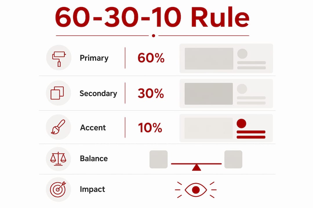
The 60-30-10 colour distribution is the industry standard for professional websites, and it gives you a reliable structure for applying your palette without guesswork.
Here is how the three tiers work in practice:
The reason this rule works is proportion. When every colour competes for attention at equal weight, the result is visual clutter that exhausts visitors. The 60-30-10 structure creates a natural visual hierarchy, so the eye moves through the page in the order you intend. This directly supports web design that drives sales by keeping attention on the actions that matter.
Pro Tip: Apply your 60-30-10 split to a real page layout, not just colour swatches. A colour that looks balanced in isolation can feel overwhelming at 30% of a full webpage. Use Realtime Colors to preview your palette on live website components before committing.
Colour harmony is the principle that certain colour combinations feel naturally pleasing together, while others create tension or confusion. Understanding the main harmony types gives you a reliable method for building palettes that feel intentional rather than accidental.
| Harmony type | Description | Best suited for |
|---|---|---|
| Monochromatic | One hue in varying shades and tints | Minimal, sophisticated brands |
| Analogous | Three adjacent colours on the colour wheel | Calm, cohesive service businesses |
| Complementary | Two colours directly opposite on the wheel | High-contrast CTAs and retail |
| Split-complementary | One base colour plus two adjacent to its complement | Balanced contrast with variety |
| Triadic | Three evenly spaced colours on the wheel | Bold, creative, or youth brands |
Complementary colour schemes provide the highest contrast and are ideal for accent elements like call-to-action buttons. A classic example is a blue primary colour paired with a bright orange CTA button. The contrast is immediate and draws the eye without requiring any additional design work.
Analogous schemes, by contrast, feel calm and cohesive. They work well for service businesses, consultants, and health providers where trust and professionalism are the priority. The risk with analogous palettes is low contrast between elements, so you need to verify readability carefully.
Pro Tip: When using Adobe Color or Coolors to generate a palette, start with your existing brand colour as the anchor. Let the tool suggest harmonious companions, then test each combination for contrast before applying it to your site.
The HSL colour model is worth understanding if you are working in CSS. HSL separates Hue, Saturation, and Lightness, which makes it far easier to create hover states and interactive effects than working with HEX values alone. For example, reducing lightness by 10% on a button hover state is a single adjustment in HSL, whereas HEX requires calculating an entirely new value.
Accessibility is not a design preference. It is a legal and ethical requirement, and colour contrast is one of the most commonly failed criteria in web audits.
Follow these steps to check and confirm your palette meets the standard:
Relying on colour alone to convey meaning is an accessibility failure. Colour indicators must be paired with text or icons to ensure usability for people with colour vision deficiencies. A red error message, for example, needs an icon or the word “Error” alongside it.
One practical step that many designers overlook is checking colour contrast on mobile screens in bright sunlight. Colours that pass contrast checks on a calibrated desktop monitor can become difficult to read outdoors on a phone. Testing on a physical device in different lighting conditions is a small habit that catches real problems before your visitors do.
Even with good intentions, colour choices go wrong in predictable ways. Knowing the common pitfalls saves you from undoing work later.
One often-overlooked tip: if your business already has print branding, do not copy those colours directly to your website. Print colours are designed for ink on paper, not light on screens. Adjust saturation and lightness to create screen-appropriate versions of your brand colours, sometimes called digital twin colours, that look consistent across digital contexts.
Effective website colour selection requires applying the 60-30-10 rule, choosing a harmony type that fits your brand, and verifying every combination against WCAG 2.2 contrast standards before launch.
| Point | Details |
|---|---|
| Apply the 60-30-10 rule | Use 60% neutral background, 30% brand colour, and 10% accent to create visual hierarchy. |
| Choose a colour harmony | Match your harmony type to your brand personality: analogous for calm, complementary for contrast. |
| Meet WCAG 2.2 standards | Confirm 4.5:1 contrast for body text and 3:1 for large text and interactive elements. |
| Avoid pure black and white | Use #333333 for text and #F8F8F8 for backgrounds to reduce eye strain and improve readability. |
| Test on real layouts | Preview your palette on actual website components using tools like Realtime Colors before committing. |
Colour decisions are where I see small business owners lose the most time. They spend hours on palette generators, collect dozens of options, and then freeze because nothing feels quite right. The honest truth is that most of the time, the first instinct is close to correct. The problem is not the palette. It is the lack of a framework for evaluating it.
What I have found works consistently is starting with a single confirmed brand colour, usually from an existing logo or print material, and building outward from there using a complementary or analogous harmony. From that point, the 60-30-10 rule handles the distribution, and a contrast check handles the accessibility. The creative decision is made once. Everything else is verification.
The other thing I would caution against is treating colour as a purely visual exercise. Colour affects how quickly visitors trust your site, how long they stay, and whether they click. Website design shapes branding in ways that go well beyond aesthetics. A Canberra trades business that uses a calm blue and white palette is sending a different signal than one using bold orange and black, and both can be right depending on the audience.
Start simple. Test on real layouts. Iterate based on what you see, not what looks good in a swatch grid. Small, steady habits in your design process create a palette that holds up over time.
— James
Colour decisions are easier when you have a clear brief, a tested palette, and someone who understands how design choices affect real business outcomes. Asporea Digital works with small businesses across Canberra and the Capital Territory to build WordPress websites that look professional, load quickly, and turn visitors into enquiries.
If you are building a new site or reviewing an existing one, Asporea Digital can help you make colour and design decisions that support your brand and your goals. Explore the WordPress marketing growth guide to see how design, content, and visibility work together for Canberra small businesses. Or get in touch directly to talk through your project.
The 60-30-10 rule is a colour distribution standard where 60% of the page uses a neutral background colour, 30% uses your primary brand colour, and 10% is reserved for a high-contrast accent colour on calls to action and interactive elements.
A professional website palette contains 3 to 5 colours: one neutral, one or two brand colours, and one accent. Keeping the palette tight prevents visual clutter and makes the site easier to maintain.
WCAG 2.2 requires a minimum contrast ratio of 4.5:1 for body text and 3:1 for large text and interactive elements like buttons. Use WebAIM Contrast Checker to verify your colour combinations before publishing.
Print colours are designed for ink on paper and often appear too dark or too saturated on screens. Adjust saturation and lightness to create screen-appropriate versions of your brand colours rather than copying print values directly.
Chromostereopsis is a visual distortion where two highly saturated, contrasting colours placed side by side appear to vibrate or shake. Avoid it by desaturating one of the colours or placing a neutral buffer between them, particularly with red and blue combinations.
Fix your newsletter signup fast. A 2 minute reader test that makes your promise clearer, builds trust, and helps your list grow.

Followers feel good but don’t pay bills. Use social for awareness and your website to convert into enquiries, bookings and sales.

Stop getting silence after you hit send. Use an AI Assisted Automated Response that reflects the enquiry and buys time properly.