Blog
Building Confidence and Guiding Customers to Checkout
Conversion is not a trick. It is the sum of small, respectful moments that reduce doubt and increase clarity.
Trust is not a nice-to-have in e-commerce. It is the first conversion. Long before a shopper reaches your basket, they are quietly deciding whether you feel safe, reliable, and worth their time. Those decisions happen in seconds and often before they even land on your site. The good news is that trust can be designed. The better news is that you can show it early and carry it through every screen, from search snippet to checkout. Let’s start where confidence begins.
People meet your brand in search results, ads, and social bios. Your title and meta description are not admin chores. They are tiny shopfronts. Write them as promises you are prepared to keep. Plain claims beat cleverness every time: delivery timeframes, returns simplicity, warranty length, and real support hours. If you have a seller rating or review count that stands up to scrutiny, surface it. If you are local, say so. A Canberra business with Aussie support instantly feels more accountable than a faceless dot-com with a PO box.
Your Google Business Profile should read like a quick brief for a nervous buyer. Keep hours and contact details current, explain delivery cut-offs in the description, and treat reviews as a live conversation. Shoppers do not expect perfection. They do expect you to reply with specifics, not paste a template apology. On social, pin a short post that answers the questions people always ask about shipping, returns, and support. Link to a single Trust Hub that gathers the essentials in one place.
When someone lands on your homepage, they are looking for four things in the first glance: what you sell, why you are credible, how quickly they will get it, and what happens if something goes wrong. Put those answers above the fold with no drama. A slim announcement bar that states your shipping cut-off and returns promise does more for confidence than a carousel ever will. Your headline should say what you do in one line, followed by a short proof strip that earns its space: star rating and review count, years in business, an honest warranty headline, and clear payment options. If you pick up the phone, show a number. If you have chat, show the hours. A visible contact link in the navigation says, we are here and reachable, which is an underrated superpower.
Microcopy matters here. Specifics beat adjectives. Try lines like, Order by 2 pm for same day dispatch, Free 30 day returns, Two year warranty on all electrics, Local support from Canberra 7 days. The tone should be calm, not salesy. Confidence is quiet.
One page, clearly named, that gathers delivery, returns, warranty, secure payments, privacy, and support hours. This is not a legal dumping ground. Start with plain language summaries and let people click through to the full policy if they need the detail. If you can record a short video that explains how returns work in under a minute, do it. It humanises your brand and sets expectations without fuss. Link this page from the top navigation and the footer, and mention it in your social bios. When people can find answers fast, they reward you with attention.
Category pages are where trust wins or dies. Shoppers are not ready for the full sales pitch, but they need reassurance to keep browsing. Give them a short reassurance line above the grid that repeats the basics on delivery times, returns, warranty, and support. Add a category-specific FAQ accordion with the top three anxieties for that range. If you sell apparel, it might be sizing and care. If you sell electronics, it might be compatibility and installation. The questions should sound like a customer typed them, not a copywriter. Keep the answers short and literal.
Within the grid, treat each product card as a small proof point. Show rating stars and review counts. If you can provide a delivery estimate by postcode, do it. An honest badge like Ships today when ordered in the next 3 hours is far more persuasive than a vague Fast shipping claim. If warranties or certifications matter for the category, surface them on the card. Display the price clearly including GST, and where it helps, link to your price match approach. None of this is decoration. It is a running conversation that says, we have thought about what you might worry about, and here is the answer before you need to ask.
Filters contribute to trust when they mirror real decisions. Prioritise size, fit, compatibility, materials, and availability today rather than obscure technical properties. If analysis paralysis is likely, offer a brief buyer’s guide or a two-question concierge that points people to the right sub-range. The message is simple: we will not waste your time.
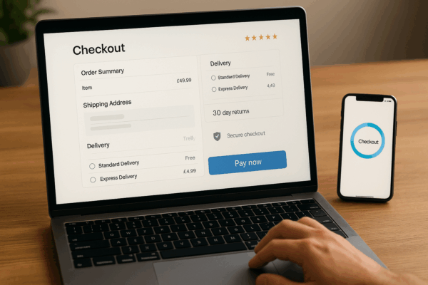
By the time someone clicks through, they want clarity more than charm. Lead with benefits that translate features into outcomes. Tell me that a pan heats evenly on induction rather than listing the alloy composition first. Keep specs easy to scan without turning the page into a catalogue. Social proof should be honest, with both the most helpful positive and the most constructive critical review visible. It reassures people that you are not curating only praise. Keep your returns summary within eye-line of the Add to bag button. People often stall at the last second when they are not sure how messy a return might be. A single sentence here beats a link buried in the footer.
Payments deserve the same clarity. Show accepted cards and wallets, trusted BNPL options if you use them, and the security reassurance near the price. Do not rely on a wall of badges. One line that says, Payments are encrypted and processed by [provider] is usually enough.
Photography and video are trust engines. Real photos with consistent lighting and scale cues help people understand size and quality. A quick looped video showing the product in use removes guesswork. Accessibility plays a part in trust too. If your type is readable, your contrast is decent, and your focus states are visible, people feel looked after. They may not be able to name why the site feels dependable. They just sense that it is.
Small operational truths make a big difference. If stock is low, say so without creating fake scarcity. If delivery timeframes vary by region, show the range clearly rather than hiding the long end behind asterisks. Spell out what happens if a parcel is lost, an item arrives defective, or a size is wrong. A short paragraph with the resolution steps is better than three pages of legalese. This is where you answer the question every cautious buyer has: if something goes wrong, will you look after me.
Most shoppers are on their phones. On a smaller screen, your reassurance bar and contact options should sit above the fold. A persistent Need help control that opens chat and lists hours prevents dead ends. Keep collapsible trust sections that remember the shopper’s last choice so they do not have to keep reopening the same details. Tiny frustrations erode confidence. Smoothness builds it.
Speed is a trust signal. Aim to become interactive quickly and avoid layout shifts that make buttons jump as ads or images load. Use animations sparingly and predictably. Your copy tone should be plain, definite, and helpful. Say what will happen, not what might. Replace hedging with clarity. People are not looking for poetry. They are looking for assurance that you do what you say.
If you cannot measure it, you will struggle to improve it. Track the percentage of visitors who view your Trust Hub and then add to cart. Watch click rates on delivery and returns microcopy on the homepage and category pages. Note any uplift in add to cart on category pages after you add review stars, ETAs, or simple reassurance lines. Ask a single-click question on product pages: Did anything here help you feel confident to buy. The feedback will tell you which signals land and which feel like wallpaper.
Many shops make the same mistakes. They flood the page with meaningless trust badges, hide returns details until the end of checkout, or undermine their own promise with fine print that cancels it out. Some copy competitors’ lines without answering their own customers’ real anxieties. The fix is to keep every trust element working hard. If a badge or line does not reduce doubt or answer a real question, it does not belong.
Trust is both a promise and a presentation. You make the promise in your policies and service. You present it in the first glance, the first click, and every tiny piece of microcopy that follows. When you design for trust, people feel safe to proceed. When they feel safe, they move forward faster. That is how confidence becomes conversion.
If you would like a clear, practical view of where your trust signals are helping and where they are quietly costing you sales, I offer a free trust audit. I will walk your home and category pages, highlight the missing or weak confidence signals, and give you a focused fix list that you can implement immediately. You will receive a prioritised set of recommendations with expected impact, and example microcopy you can paste straight in. No obligation, just useful feedback you can act on.
Get my free trust audit and let’s make the first conversion happen before the first click.
Conversion is not a trick. It is the sum of small, respectful moments that reduce doubt and increase clarity.

If your business won’t sustain itself through a medium-term of lockdowns and disruption then consider what will.
Small business in the Capital Region can reach more customers with a website. Go beyond social media and grow your local reach.
[asporea_chat]