
Education and Planning

Turn Your Reflections Into a Goals for 2026
Turn your reflections into clear, practical goals for 2026 with a simple framework and an easy worksheet.

The most effective ways to present building packages on a website combine pricing clarity, strong visuals, and a layout that guides visitors toward a decision without friction. Developers and marketing professionals who get this right attract better leads and close more of them. The difference between a package page that converts and one that confuses usually comes down to three things: how pricing is structured, how options are displayed visually, and how clearly the page directs the visitor to act. This article covers each of those areas with specific, tested approaches you can apply directly.
A three-tier pricing structure is the most reliable format for presenting building packages online. Three-tier layouts outperform four-plus tier arrangements by 20–30% in conversion and reduce decision paralysis. Giving visitors three clear options, typically a base, mid-range, and premium, creates a natural comparison without overwhelming them.
Pricing transparency matters just as much as structure. Transparent pricing improves lead quality because 70–80% of visitors prefer to self-qualify before making contact. When a page hides pricing entirely, visitors either leave or submit low-quality enquiries. Showing a price or a clear range removes that friction.

For building projects where scope varies significantly, a “from” pricing model works well. From pricing and custom quotes maintain transparency while managing expectations when final costs depend on site conditions, materials, or project size. Pair this with a short explanation of what affects the final price and visitors will trust the number rather than question it.
The visual design of your pricing table affects how visitors feel about each package, not just what they think.
Pro Tip: Place the annual or total project cost in a larger font than the per-month or per-stage breakdown. Visitors scan for the big number first. If that number looks reasonable, they read the detail.
High-quality visuals are not decorative. They do the work of communicating what words cannot. Professional photos, sketches, and detailed illustrations help visitors understand what each building package delivers before they read a single line of copy. A floor plan or rendered elevation tells a prospect more in three seconds than a paragraph of specifications.
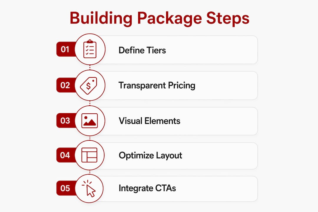
For building packages specifically, the visual hierarchy should match the decision hierarchy. Show the finished result first, then the process, then the specifications. Visitors want to see what they are buying before they care about how it is built.
Consistent branding across all visuals reinforces professionalism. Fonts, colour palettes, and photo styles should match across the package page and the rest of the site. Inconsistency reads as disorganisation, which is a serious credibility problem in the building industry. The role of professional imagery in marketing conversion is well established. Visitors form trust judgements within seconds of landing on a page, and visual quality is the primary signal they use.
Pro Tip: Commission photography at project completion for every package tier you offer. Even one strong photo per tier gives you an asset that will outperform stock imagery for years.
Layout is where most building package pages lose visitors. The page may have good pricing and strong visuals, but if the structure forces visitors to hunt for information, they leave. Clearly segmented service packages improve navigation and reduce buyer hesitation. Each package should be visually distinct and scannable within five seconds.
Mobile responsiveness is non-negotiable. Pricing tables with side-by-side columns break on mobile and become unreadable. The fix is to stack columns vertically or convert them to an accordion format on smaller screens. Touch targets should meet the minimum 48×48 pixel guideline so visitors can tap options without frustration. A mobile-first approach to pricing pages increases overall engagement, particularly in Australia where the majority of site visits happen on mobile devices.
| Layout approach | Best for | Key consideration |
|---|---|---|
| Side-by-side columns | Desktop visitors comparing tiers | Must stack vertically on mobile |
| Accordion per package | Mobile-first pages | Hides detail until tapped; reduces overwhelm |
| Feature checklist rows | Packages with many shared features | Use dashes, not red X marks, for absent features |
| Card-based layout | Visual-heavy packages | Each card should include image, price, and one CTA |
Pro Tip: Test your package page on a real mobile device, not just a browser preview. Tap every button and scroll through every section. Browser previews miss touch-target problems and font-size issues that real users encounter.
The placement of calls to action within the layout matters as much as the CTA text itself. Place a primary CTA button at the bottom of each package card and a secondary CTA at the top of the page for visitors who already know what they want. Avoid burying the CTA below a long block of specifications. Visitors who are ready to act should not have to scroll to find the button.
Calls to action on building package pages work best when they are specific to each tier rather than generic across the whole page. Plan-specific CTA text such as “Get a quote for the Standard Package” converts better than “Contact us.” The specificity signals that clicking the button leads somewhere relevant, not to a generic contact form.
A structured approach to CTA placement across a package page looks like this:
Transparency in pricing and process builds the trust that makes CTAs work. When visitors understand what they are getting, what it costs, and what happens after they click, conversion rates improve. The features of effective service websites consistently include pricing clarity and process transparency as the two strongest trust signals.
Presenting building packages clearly online is the single most direct way to improve lead quality and reduce the time spent on unqualified enquiries.
| Point | Details |
|---|---|
| Use three pricing tiers | Three options reduce decision paralysis and outperform four-plus tier layouts in conversion. |
| Show pricing or clear ranges | Transparent pricing self-qualifies visitors and produces higher-quality leads. |
| Stack tables on mobile | Side-by-side columns break on small screens; use vertical stacking or accordions instead. |
| Use tier-specific CTA text | “Get a quote for the Standard Package” converts better than a generic “Contact us” button. |
| Place trust markers near CTAs | A testimonial or process note directly above a button reduces hesitation and lifts clicks. |
Building a package page that actually converts takes more than good intentions. It requires the right structure, mobile-ready design, and copy that guides visitors to act.
Asporeadigital builds fixed-price WordPress websites for Canberra businesses, including package and pricing pages designed around the principles covered here. If your current site buries pricing, breaks on mobile, or sends visitors away without enquiring, that is a fixable problem. Asporeadigital’s homepage design approach applies the same clarity and conversion thinking to every page of a site, not just the homepage. For businesses ready to take their digital presence seriously, modern website design is the practical next step.
Three tiers is the most effective number. Three-tier pricing structures reduce decision paralysis and outperform layouts with four or more options in conversion rate.
Yes, where possible. Transparent pricing or clear price ranges self-qualifies visitors and produces better leads. Use “from” pricing when scope varies significantly.
Stack columns vertically or convert the table to an accordion format on small screens. Touch targets should be at least 48×48 pixels to remain usable on mobile devices.
Tier-specific text such as “Get a quote for the Standard Package” converts better than generic options like “Contact us” or “Sign up.” Specificity signals relevance and reduces hesitation.
Client testimonials, transparent pricing, and a short reassurance note about response time placed directly near the CTA button reduce friction and increase conversion likelihood.

Turn your reflections into clear, practical goals for 2026 with a simple framework and an easy worksheet.

Membership site problems are common. Learn what causes them and how strategy and technology can help fix them.

Help January customers choose with confidence by aligning your products with what they want at the start of a new year.